حدد النسب التي تجعل الشكل العائلي مميزًا، ثم اسمح بإجراء تعديلات هندسية غير مرئية تدعم قابلية التكرار.

كانت شركة العطور تعمل على إعداد مجموعة تهدف إلى إظهار هوية علامة تجارية واحدة من خلال قصص عطرية متنوعة. وقد اعتمد التوجيه الإبداعي على زجاجة مستطيلة ذات تصميم منضبط، وأكتاف متناسقة، وزجاج سميك، وأسطح غير لامعة هادئة، ولمسات معدنية متحفظة. وستختلف السعة والتصميم الفني من منتج لآخر؛ أما القواعد البصرية فلا ينبغي أن تتغير.
تضمنت المواصفات قرارات مفيدة تتعلق بالعلامة التجارية، لكن منطق الإنتاج كان غير مكتمل. وأظهرت الصور المرجعية العلاقة المقصودة بين الزجاجة والغطاء. ووصفت قيم الألوان الرقمية الألوان الأسود والأبيض والذهبي. وحددت ملفات التصميم أسماء العطور والنصوص المكتوبة على الوجهين الأمامي والخلفي. ومع ذلك، لم تكن العناصر التالية مترابطة بشكل كامل: تشطيب عنق الزجاجة، ونوع المضخة، والارتفاع بعد التركيب، وتصميم الطوق، وتثبيت الغطاء، وحدود الطلاء، ومساحة الزخرفة، وتصميم الكرتون، ونظام المراجعة على مستوى وحدة التخزين (SKU).
ولذلك، فقد فصلت المراجعة الأولى الخيارات المتاحة للمستهلكين من الخيارات المتعلقة بالنظام. يمكن أن تساهم السعة واسم العطر واللمسة النهائية المختارة في تمييز المنتج في أعين المستهلكين. أما الشكل الهندسي للرقبة، ومنصة المضخة، ونمط المشغل، وغطاء العنق، وواجهة الغطاء، وطريقة الاعتماد، فكانت جميعها عناصر مرشحة للتوحيد القياسي. ولم تكن مهمة الفريق هي القضاء على التباين، بل وضع التباين في الأماكن التي يخلق فيها قيمة للعلامة التجارية، وإزالته من الأماكن التي لا يؤدي إلا إلى تكبد تكاليف أو إحداث عدم يقين.
أدى هذا التمييز إلى تغيير تسلسل العمل. فبدلاً من إدراج كل SKU مرئي كمنتج منفصل، قامت شركة DAXIN بـ عملية إدارة المشاريع ويمكن تطبيق ذلك على مصفوفة واحدة: الزجاجات حسب السعات، والتشطيبات حسب المواد، والتصميمات الفنية حسب العطور، والمكونات حسب الموردين، والمراحل الرئيسية حسب جدول الإطلاق المشترك. وستتم الموافقة على العبوة على الصعيدين الرأسي — لكل وحدة تخزين (SKU) بدءًا من الزجاجة وحتى الصندوق — والأفقي — حيث تتم مقارنة كل حجم وتشطيب مع بقية العائلة.
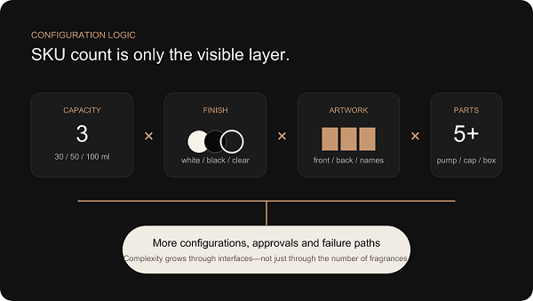
منطق التكوين. تتزايد درجة التعقيد من خلال التفاعل بين الأحجام والتشطيبات والأعمال الفنية والمكونات — وليس فقط من خلال عدد العطور.
إن إضافة عطر واحد لا تقتصر على إضافة ملف تصميم واحد فحسب. بل يمكن أن تؤدي إلى إضافة اسم جديد للوجه الأمامي، ونص على الظهر، ولوحة المعلومات التنظيمية، وطباعة الكرتون، والباركود، وموقع المخزون، ومرجع الجودة، وبند في قائمة التعبئة، وموقع منصة التحميل. وإذا كان العطر الجديد يستخدم سعة أو لونًا مختلفين أيضًا، فإن ذلك يؤثر على الطلاء، والزخرفة، وتصميم الزجاجة، والتغليف الوقائي، وعينات الموافقة. ويُعد رقم SKU الظاهر مجرد العنصر الأخير في شبكة تحكم أوسع نطاقًا.
لنتخيل نموذج تخطيط يتضمن ثلاث سعات للزجاجات، وإصدارات مطلية باللونين الأسود والأبيض، وإصدار شفاف، والعديد من التصاميم الفنية للأمام والخلف، بالإضافة إلى مضخة، وغطاء عنق الزجاجة، وغطاء، وعلبة خارجية. العدد النظري للتركيبات لا يمثل خطة الإنتاج؛ فالعلامات التجارية عادةً ما تطرح مجموعة فرعية مختارة فقط. لكن يجب فهم كل تركيبة مسموح بها ومحظورة. وإلا فقد يتم تعبئة غطاء ذهبي صحيح مع زجاجة خاطئة، أو وضع تصميم فني مخصص لزجاجة سعة 50 مل على مساحة الزخرفة الخاصة بزجاجة سعة 100 مل، أو تزويد مضخة ذات عنق صحيح بطول أنبوب غمس خاطئ.
ويكون هذا النمو أسرع من النمو الخطي بسبب وجود مخاطر عند نقاط التداخل. فثلاث سعات تنتج ثلاثة تصاميم للزجاجات، لكنها قد تؤدي أيضًا إلى ثلاث حالات من الفجوة بين الغطاء والجسم، وثلاثة مجالات للزخرفة، وثلاثة أبعاد للكرتون، وثلاثة أنماط من الاستقرار. ويؤدي لونان إلى معيارين للطلاء، لكن المقارنة المباشرة تثير سؤالًا ثالثًا: هل يعبر كلا الطلاءين عن نفس المستوى من الجودة الفائقة؟ وتؤدي أربعة تصاميم فنية إلى أربعة ملفات، ومع ذلك يجب أن يمنع نظام التحكم في المراجعة التخصيص المتبادل بين أحجام الزجاجات والألوان.
التباين | لماذا العلامات التجارية ترغب في ذلك | المخاطر التشغيلية | الاستراتيجية الموصى بها |
قدرات متعددة | تُستخدم صيغ «السفر» و«البطل» و«القيمة» في قنوات مختلفة. | قد تتغير النسب، وفجوات الأغطية، ومساحات الزخرفة، والعلب. | صمم مجموعة مترابطة وتحقق من كل سعة تجميعية. |
زجاجات سوداء وبيضاء وشفافة | تمييز قصص العطور دون تغيير الشكل الأساسي. | تختلف سلوكيات اللمعان، والعتامة، والملمس، وتباين الزخارف. | الموافقة على نماذج نهائية مادية تمثيلية على الزجاج الفعلي. |
عدة ملفات لأعمال فنية | أعطِ كل عطر اسمه الخاص ومعلومات النسخ والمعلومات التنظيمية الخاصة به. | تصل إلى مرحلة الإنتاج ملفات أو نسخ أو أوضاع أو تخصيصات أحجام خاطئة. | استخدم مصفوفة SKU منظمة وتأكيدًا مرئيًا قبل الإنتاج. |
المكونات المعدنية | ابتكر توقيعًا عائليًّا مميزًا. | يختلف لون الذهب باختلاف المواد المستخدمة، سواء كانت البلاستيك أو الألومنيوم أو الزاماك أو الطلاء أو رقائق المعدن. | الموافقة على تصميم بصري واحد من خلال عينات مادية خاصة بالركيزة. |
علب كرتون مخصصة | دعم سرد القصص، والحماية، والعرض في متاجر البيع بالتجزئة. | قد لا تتطابق أبعاد العبوة أو العلامة المطبوعة مع شكل الزجاجة النهائي. | يتم فك هياكل الصناديق بعد أن تصبح أبعاد العبوة النهائية ثابتة. |
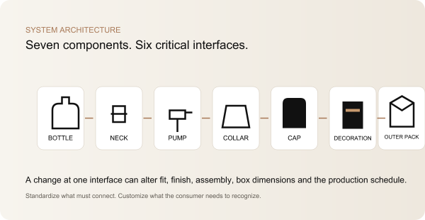
تحدد بنية التغليف القواعد الثابتة التي تقوم عليها المجموعة. فهي تحدد القرارات المشتركة، وتلك التي يمكن أن تختلف، والأبعاد التي تتحكم في الأجزاء التالية في سلسلة الإنتاج، والمراجع المادية التي تحكم المظهر. وهي تعادل نظام تصميم العلامة التجارية في مجال التغليف: فهي تقييدية حيثما يكون عدم الاتساق مكلفًا، ومرنة حيثما يكون للتمييز مغزى.
بدأت مراجعة التصميم المعماري من الزجاجة، لكنها لم تنتهِ عند هذا الحد. شملت لغة تصميم الزجاجة الانتقال من الجسم إلى الكتف، وشكل القاعدة، ونصف قطر الزوايا، ونسبة العنق إلى الجسم. حدد تصميم العنق واجهة المضخة. وأثرت مجموعة المضخات على الارتفاع المركب، والمشغل، والطوق، وتجويف الغطاء. وتحدد الغطاء العرض المرئي للإغلاق والملحق الكرتوني. وحددت قواعد الزخرفة مناطق الشعار، والعلاقات المعدنية، والحد الأدنى للمساحة الخالية. وورثت بنية الكرتون الأبعاد النهائية وهوية وحدة التخزين (SKU).
لم تعنِ التوحيد القياسي أن تبدو كل زجاجة متطابقة تمامًا. فقد تستخدم زجاجة سعة 30 مل نسبة بين العنق والجسم أعلى قليلاً من زجاجة سعة 100 مل. وقد تتطلب النسخة السوداء تباينًا مختلفًا في الشعار مقارنةً بالنسخة الشفافة. وكان المعيار هو منطق التصميم: أكتاف متناسقة، ولغة أساسية ثابتة، ونسب مشتركة للغطاء، وتصميم ذهبي واحد، وقاعدة متسقة لموضع الشعار. أما الاختلاف فكان استجابةً منظمةً للسعة، والمادة المصنوعة منها الزجاجة، والتصميم الفني.
كانت القيمة الاستراتيجية تراكمية. فقد ساهمت منصة الضخ الموحدة في الحد من مشكلات التوافق وتبسيط عملية التخطيط لمكونات قطع الغيار. كما ساهم الغلاف الموحد في الحد من الانحراف البصري. وجعلت مبادئ التصميم المشتركة للعبوات الكرتونية عملية التطوير الهيكلي أكثر قابلية للتنبؤ بها، حتى في حالة تغير الأبعاد. كما ساهم وجود تسلسل هرمي واحد للموافقة في الحد من الجدل حول أي صورة أو مرفق بريد إلكتروني يمثل القرار الأحدث.
المكوّن | موحدة أو مخصصة | المخاطر الرئيسية | طريقة التحكم |
جسم الزجاجة | الهندسة المتشابهة عبر السعات المختلفة؛ ويختلف اللون النهائي حسب رقم المنتج (SKU). | يؤدي التناسب الرياضي إلى نسب غير مترابطة أو توزيع غير مستقر للزجاج. | تمت مراجعة الرسومات الخاصة بالقدرات باعتبارها مجموعة مرئية واحدة. |
تشطيب الرقبة | يتم توحيد المواصفات حيثما يسمح بذلك نوع الحشو والسعة. | عدم توافق المضخات أو اختلاف ارتفاعات تركيبها. | واجهة واحدة محددة بين العنق والمضخة مع التحقق من السعة. |
المضخة والمشغل | عائلة شائعة؛ قد يختلف طول أنبوب الغطس. | جرعة غير صحيحة، أو إزالة غير صحيحة، أو ختم غير صحيح، أو طول أنبوب غير صحيح. | مواصفات التجميع وفحوصات الأداء على مستوى الزجاجة. |
الياقة والقبعة | يُفضل توحيد التصميم الخارجي حيثما أمكن ذلك؛ أما نظام التثبيت الداخلي فيمكن أن يختلف. | فجوات غير متساوية، أو مقاس فضفاض، أو تلامس المشغل، أو اختلال في المحاذاة. | تمت مراجعة التفاوتات في التجميع والموافقة على نماذج القياس القياسية. |
الديكور | نظام المراكز المشتركة والنتائج النهائية والهدف الذهبي؛ تختلف الأعمال الفنية. | تباين في اللون واللمعان وموضع الشعار. | نسخ أصلية مادية بالإضافة إلى مصفوفة أعمال فنية خاضعة للرقابة. |
العبوة الخارجية | تصميم قياسي؛ تختلف الأحجام والتصاميم الفنية. | صوت خشخشة، أو خدوش، أو خطأ في الملصق، أو ملحق غير صحيح. | تصميم المنتج وفقًا لأبعاد العبوة النهائية وخريطة رموز SKU. |
يمكن للكمبيوتر تقليص تصميم سعة 100 مل إلى 50 مل و30 مل مع الحفاظ على التماثل الرياضي التام. ومع ذلك، قد تفشل النتيجة كسلسلة زجاجات. فالإدراك البشري لا يقيّم النسب كنسب رياضية فحسب. فعنق الزجاجة الذي يبدو متوازناً في الزجاجة الكبيرة قد يبدو مهيمنًا على الزجاجة الصغيرة. كما أن القاعدة التي تعكس ثقل الزجاجة ذات الحجم الرئيسي قد تستهلك مساحة بصرية أكبر من اللازم في الزجاجة ذات الحجم الصغير المخصص للسفر. وقد تبدو انحناءات الكتف التي تحتفظ بلمعة واضحة في الزجاجة سعة 100 مل ناعمة عند تصغير الحجم.
كما أن السعة تنبع من الحجم الداخلي، وليس فقط من الحجم الخارجي. فسمك القاعدة، وتوزيع الجدران، والجزء المحدب، وامتلاء الكتف، وهندسة العنق، كلها عوامل تؤثر على السعة والوزن. فإذا تم تقليص كل الأبعاد الخارجية بنفس النسبة، فإن توزيع الزجاج وإمكانية التصنيع لا يظلان متكافئين تلقائيًا. فقد تحتاج الزجاجة سعة 30 مل إلى تعديل متعمد في شكل الكتف أو المقطع الداخلي للقاعدة للحفاظ على الطابع المميز للسلسلة دون فرض مقطع غير عملي.
لذلك، تعاملت مراجعة «عائلة الزجاجات» التي أجرتها شركة «داكسين» مع كل سعة على أنها جزء من عائلة ذات لغة تصميمية مشتركة، وليس كنسخة مصغرة. وتم مقارنة نسبة عرض الجسم إلى ارتفاعه، وخط انحناء الكتف، وشكل القاعدة، وشكل غلاف السدادة من الأمام، ومن الجانب، ومن زاوية ثلاثة أرباع. كما تم تراكب مساحات الزخرفة لمعرفة ما إذا كان الشعار يشغل نفس المنطقة البصرية. وظلت استقرار الزجاجة وسطح الوقوف من القيود الفنية، في حين ظلت الكتلة الزجاجية المرئية من قيود العلامة التجارية.
وقد حافظت مراجعة عملية التصنيع على هذا التسلسل الهرمي. وساعدت نصف أقطار الزوايا التي تم التحكم فيها على تسهيل إخراج المنتج من القالب وضمان تكرار الملامح البارزة. وتم تقييم الانتقال إلى القاعدة من حيث تدفق الزجاج، بدلاً من رسمه ككتلة سميكة عشوائية. كما تمت مواءمة العلاقة بين العنق والجسم مع نظام الإغلاق قبل تجميد مسار القالب. وهنا تطوير قوالب زجاجات العطور يصبح الأمر قرارًا على مستوى النظام بدلاً من مجرد شراء رسم واحد.
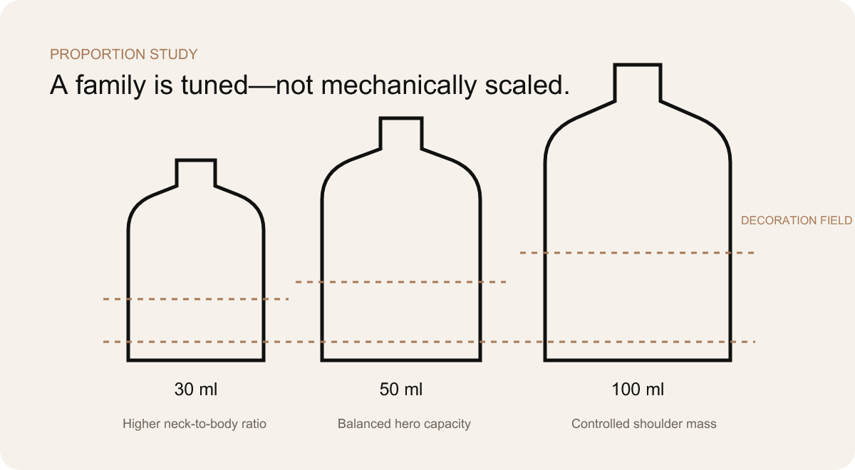
حدد النسب التي تجعل الشكل العائلي مميزًا، ثم اسمح بإجراء تعديلات هندسية غير مرئية تدعم قابلية التكرار.
لا يمكن تجميد السعة الاسمية، والأبعاد الخارجية، وشكل القاعدة، وتوزيع الزجاج بشكل مستقل.
يمكن أن تبدو كل زجاجة جذابة بحد ذاتها، في حين تبدو المجموعة غير متناسقة عندما تُعرض الزجاجات ذات السعات المختلفة على الرف نفسه.
تجميع تجعيد دقيق من الناحية الفنية. يتشكل كأس المضخة حول طرف مجعد غير ملولب؛ ويتم التحقق من أبعاد الطوق والغطاء بعد التركيب.
المنتجات الحالية لشركة داكسين خيارات المضخة والطوق والإغلاق حسب الطلب تقدم هذه الدراسة سياق اختيار الموردين، لكن القرار المتخذ في دراسة الحالة يظل محددًا: فلا يصبح المكون مناسبًا إلا عندما تتوافق واجهته ومظهره وكميته وطريقة إنتاجه مع المجموعة بأكملها.
نظام الإغلاق هو النقطة التي يلتقي فيها التصميم المرئي مع واقع خط التعبئة. لا يتم اختيار مضخة العطر بعد الانتهاء من تصنيع الزجاجة والغطاء؛ بل إنها تقع بينهما وتحدد شكل كلتا الواجهتين. يجب أن يتناسب عنق الزجاجة مع المضخة. ويحدد ارتفاع المضخة المركبة شكل طوق الزجاجة. ويجب أن يعمل المشغل بحرية. كما يجب أن يثبت الغطاء بشكل صحيح دون ملامسة المشغل. ويجب أن يكون الغطاء المُركَّب مستقيمًا وأن يخلق الفجوة البصرية المقصودة فوق كتف الزجاجة.
في حالة زجاجة العطور ذات العنق المكبس، لا تحتوي حافة الزجاج على خيوط لولبية. يتم تثبيت كوب المضخة المعدني ميكانيكيًا حول شكل عنق الزجاجة المحدد، مما يؤدي إلى ضغط نظام الإحكام على الزجاجة. ومن الناحية الفنية، سيكون من الخطأ إظهار عنق ملولب في تركيبة التثبيت. وإذا تم اختيار طريقة العنق الملولب بدلاً من ذلك، فإن الزجاجة والمضخة وعملية التعبئة تتبع طريقة مختلفة للربط والتركيب. يجب أن تحدد مواصفات المشروع الطريقة الفعلية؛ فالعبارة “العنق القياسي” ليست كافية.
وحيثما سمحت القدرات ومتطلبات توزيع العطر بذلك، كان هناك مضخة رش العطور تقلب محدود ضمن العائلة. ولم يعني ذلك أنه يمكن تركيب مضخة نهائية واحدة متطابقة في كل زجاجة دون مراجعة. فقد ظل طول أنبوب السحب مرتبطًا بالسعة المحددة. ولا يزال من الضروري تحديد طول الأنبوب وانحنائه والجرعة وتوافق الحشية وارتفاع التركيب وطريقة التعامل مع خط التعبئة. وقد ساهمت العناصر المشتركة في تبسيط المنصة؛ لكنها لم تلغِ عملية التحقق من الصحة.
تم التعامل مع المشغل والطوق على أنهما جزءان هندسيان ظاهران. فقد يؤدي تغيير بسيط في ارتفاع المضخة إلى كشف الطوق الموجود أسفل الغطاء. كما أن الطوق الزخرفي السميك قد يقلل من الخلوص الداخلي للغطاء. وقد يثير الغطاء المغناطيسي تساؤلات حول الاتجاه وموضع المغناطيس. وقد تبدو الملحقة المثبتة بالاحتكاك فضفاضة في حالة من حالات التفاوت، ومشدودة بشكل مفرط في حالة أخرى. وهذه ليست مشاكل تجميلية أُضيفت في النهاية، بل هي وظائف للنظام الذي تم اختياره منذ البداية.
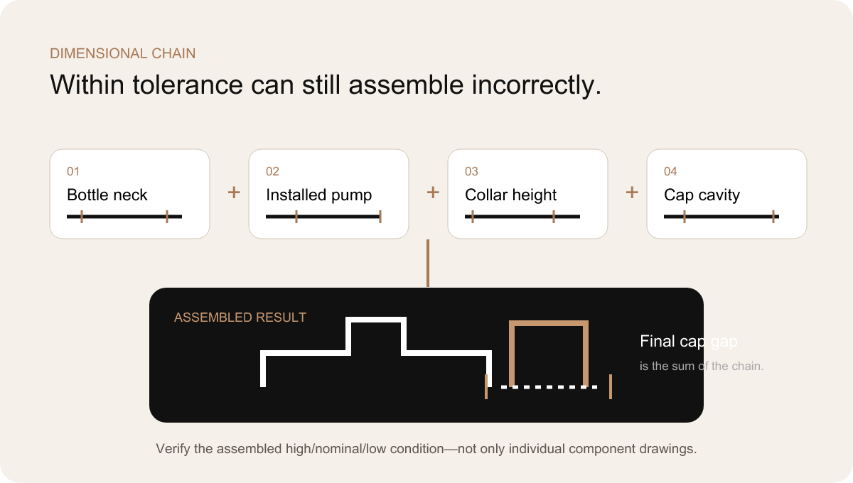
يوجد تباين مقبول في الأبعاد لكل مكون مصنّع. فقد يكون عنق الزجاجة أعلى أو أقل قليلاً ضمن المواصفات المحددة له. ويمكن تركيب المضخة على ارتفاعات مختلفة. كما يختلف كل من الطوق وتجويف الغطاء. وقد يجتاز كل جزء الفحص الفردي الخاص به، إلا أن تراكم هذه الاختلافات في الاتجاه الصعودي أو الهبوطي قد يؤدي إلى إنتاج عبوة مجمّعة تبدو غير صحيحة أو تعمل بشكل سيئ.
هذا هو تراكم التفاوتات في التفاوتات، مع شرحه بلغة سهلة الفهم للمشتري: اختلاف شكل الزجاجة + اختلاف نوع المضخة المركبة + اختلاف شكل الطوق + اختلاف شكل الغطاء = النتيجة النهائية للتجميع. المعادلة هنا مفاهيمية وليست عددية؛ ولم يتم الكشف عن أي تفاوتات في المشروع. وتكمن أهميتها في توضيح سبب عدم كفاية وجود رسم لكل مكون على حدة. فلا بد من تحليل السلسلة وتجميع المجموعة.
الأعراض مألوفة. يقع الغطاء في موضع أعلى على أحد أحجام الزجاجات. تتغير الفجوة بين الغطاء والزجاجة على طول محيطها. يظهر طوق معدني. يلامس المشغل الجزء الداخلي للغطاء ويحدث تفريغ أثناء الإغلاق. يكون الغطاء الاحتكاكي سهل الفك في إحدى العينات، بينما يكون محكمًا للغاية في عينة أخرى. يتوقف الغطاء المغناطيسي قبل أن يتحقق محاذاة تامة. يبدو أن الزجاجة والغطاء لهما خطان مركزيان مختلفان، على الرغم من أن كل جزء يتوافق مع أبعاده الخاصة.
كانت طريقة المراقبة تتمثل في تحديد الأبعاد التي تسهم في النتيجة المرئية والوظيفية، وتحديد العلاقات بين القيم العالية والاسمية والمنخفضة، ومراجعة ظروف التجميع. وقد حددت العينة النموذجية الهدف، لكن كان لا بد أن يصف الرسم الهندسي الإطار المحيط بهذا الهدف. فالموافقة على العينة استنادًا إلى تجميع مثالي واحد فقط لن تكشف عن مجموعة قد تصبح محفوفة بالمخاطر عند حدود الإنتاج.
وقد أثر هذا المنطق أيضًا على التنسيق بين الموردين. فعندما يقوم موردو الزجاجات والمضخات والأغطية بتحسين مكوناتهم بشكل مستقل، لا يتحمل أي منهم مسؤولية الفجوة النهائية. لذا، يجب أن يتولى شريك تكامل المشروع مسؤولية واجهة التوصيل: حيث يتعين عليه جمع المواصفات ذات الصلة، ومقارنة شروط التركيب، وتحديد الأماكن التي يكون فيها التعديل عمليًّا، والتأكد من اكتمال التجميع قبل بدء الإنتاج بكميات كبيرة.
المكوّن | بعد مهم | احتمال حدوث عطل | التحقق |
العنق الزجاجي | الشكل النهائي، والارتفاع، والتراكز | لا تستقر المضخة بشكل ثابت؛ ويبدو أن الطوق أو الغطاء مائل. | قياس الأبعاد الحرجة لعنق الزجاجة وتجميعها على زجاجات تمثيلية. |
المضخة | الارتفاع بعد التركيب، شكل الكأس، موضع المشغل | انكشاف الياقة، أو ملامسة المشغل، أو عدم اتساق خط الغطاء. | تحديد طريقة التركيب وقياس الحالة بعد التجميع. |
طوق | الارتفاع الإجمالي، والمسافة الداخلية، والقطر الخارجي | وجود شريط مرئي، أو تداخل، أو عدم انتظام في العلاقة مع الغطاء. | قارن التجميعات الاسمية والحدودية بالنموذج المرئي المعتمد. |
الغطاء | الارتفاع الداخلي، الشكل الهندسي للاحتجاز، موضع المغناطيس أو الملحق | تركيب فضفاض/ضيق، نقطة توقف غير صحيحة، اهتزاز أو اختلال في المحاذاة. | فحوصات الأداء والمظهر باستخدام عينات تمثيلية من المكونات. |
زجاجة فارغة | الطلاء والزخرفة عند واجهة الإغلاق | تبدو الفجوة المرئية مختلفة أو تظهر خدوش على الأسطح أثناء الإغلاق. | الموافقة على التشطيب النهائي والتجميع، وليس على الزجاج العاري وحده. |
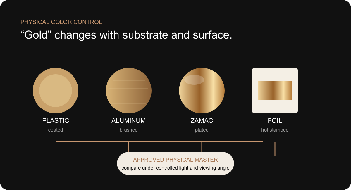
“استخدام نفس اللون الذهبي في كل مكان” هو أحد متطلبات العلامة التجارية، وليس تعليمات إنتاجية. فاللون الذهبي على الغطاء البلاستيكي، أو القطعة المطلية بالزاماك، أو الطوق المصنوع من الألومنيوم المؤكسد أو المطلي، أو رقائق الختم الساخن، أو الحبر المطبوع، يتم إنتاجه باستخدام مواد وآليات بصرية مختلفة. وحتى عندما يتلقى كل مورد نفس المرجع الرقمي للون، فإن النتائج المادية قد تختلف.
تُغير المادة الأساسية الطريقة التي ينعكس بها الضوء إلى المشاهد. فالألومنيوم المصقول يُنتج انعكاسات ضوئية موجهة، بينما يعمل السطح المطلي اللامع بشكل شبه مرآة. أما البلاستيك المطلي بالمعدن فيحمل نسيج وهندسة القطعة المصبوبة الموجودة تحته. أما الرقاقة المعدنية فهي رقيقة ومسطحة وتتأثر بشدة بالسطح الذي تُطبع عليه. كما أن سماكة الطلاء واتجاه الجسيمات المعدنية واللمعان والنسيج تُغير الإدراك البصري بشكل أكبر. فقد يبدو التماثل تحت ضوء معين مختلفًا عند زاوية رؤية أخرى.
وكانت الاستجابة العملية عبارة عن سلسلة مرجعية: التوجيه الرقمي → عينات العمليات المادية → النموذج الرئيسي المعتمد → مقارنة الإنتاج. ظل الهدف الرقمي مفيدًا لأغراض التواصل، لكنه لم يكن ليكون المعيار الوحيد لإطلاق المنتج. فقد تم عرض عينات تمثيلية معًا تحت نفس الإضاءة، وبنفس الاتجاه، وبجانب زجاجات سوداء وبيضاء وشفافة. وكان الهدف هو تحقيق مظهر متناسق، وليس الادعاء المستحيل بأن المواد الأساسية المختلفة تصبح متطابقة بصريًّا.
كان لا بد من وجود عنصر واحد يرسخ الرؤية التصميمية. واعتمادًا على المشروع، قد يكون هذا العنصر هو الغطاء أو الياقة أو الرقاقة الزخرفية. وتم توجيه العمليات الأخرى نحو هذا العنصر. وإذا ثبت أن المحاذاة الدقيقة غير واقعية، كان بإمكان الفريق تعديل درجة اللمعان أو الفصل بين التشطيبات عمدًا بحيث يبدو الاختلاف متعمدًا. يمكن أن يتعايش غطاء ذو ملمس ساتاني خفيف مع رقاقة لامعة إذا تم التحكم في التسلسل الهرمي بينهما؛ أما اللونان الذهبيان اللامعان المتشابهان تقريبًا فيبدوان غالبًا وكأنهما خطأ.
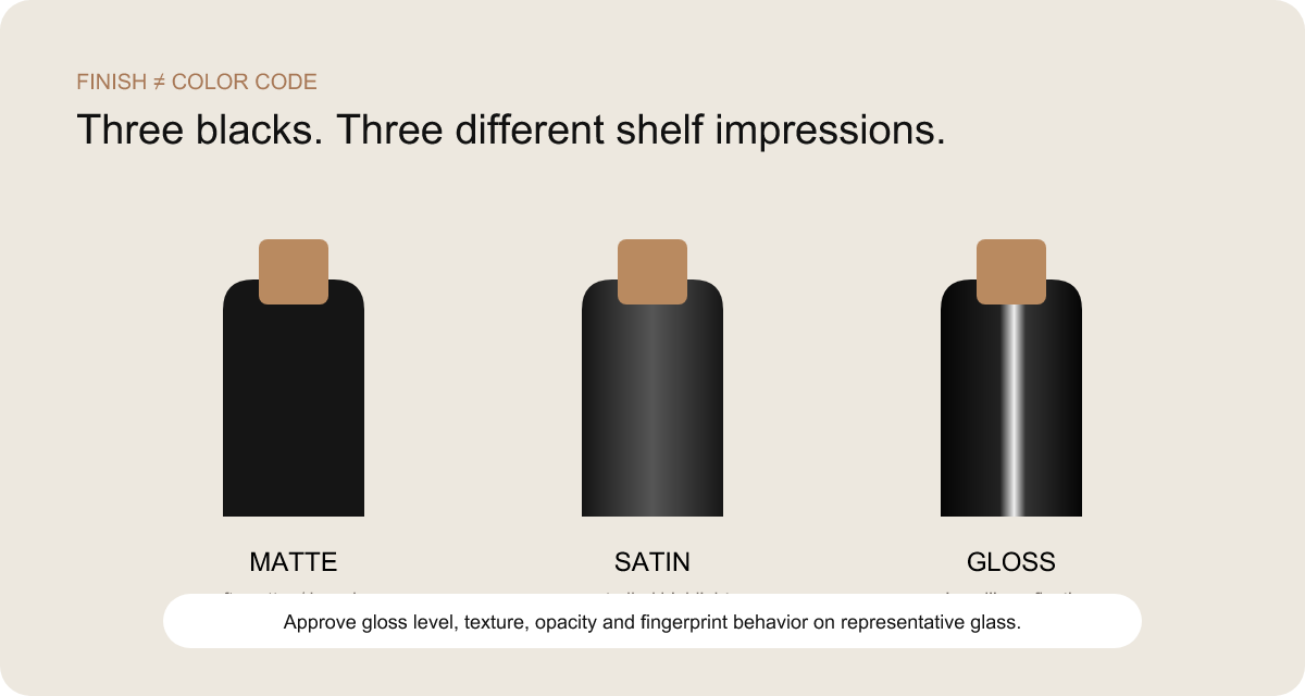
قد تحمل زجاجتان نفس اللون الأسود الاسمي، ومع ذلك تبدو غير متشابهتين عند وضعهما جنبًا إلى جنب. إحداهما تمتص الضوء بفضل سطحها الجاف والمخملي، بينما تنتج الأخرى انعكاسات ساتانية واسعة. أما الثالثة، فتكشف عن لمعان غير متساوٍ عند الكتف أو تبدو رمادية اللون في الأماكن التي يصبح فيها الطلاء رقيقًا. ولا يكفي نظام «بانتون» وحده لوصف هذه الاختلافات.
تشمل التحكم المتطور في المظهر غير اللامع مستوى اللمعان، والملمس الدقيق، وسماكة الطلاء، ودرجة التعتيم، وتأثير الركيزة، وسلوك المعالجة والتصلب. قد يؤدي وجود زجاج شفاف أسفل الطلاء إلى جعل الطبقة السوداء الرقيقة تبدو أقل عمقًا عند الحواف. أما اللون الأبيض فقد يتطلب درجة تعتيم كافية لمنع ظهور مظهر باهت أو شفاف. تعكس الأكتاف المنحنية الضوء الموجه بشكل مختلف عن الألواح المسطحة. وقد تظهر السعة الأكبر تباينًا أكبر في السطح لمجرد أنها توفر مجالًا أوسع.
ولذلك، تم أخذ عينات من البرامج ذات الألوان الأسود والأبيض بناءً على الشكل الهندسي التمثيلي للزجاجة، وليس فقط على رقائق الألوان المسطحة. وناقشت المراجعة كيفية انتقال اللمسة النهائية من اللوحة الأمامية إلى الزاوية والكتف، وما إذا كانت حافة القاعدة تظل نظيفة، وما إذا كان الزخرف يحقق تباينًا كافيًا، وما إذا كانت بصمات الأصابع تغير الانطباع الذي تتركه الزجاجة على الرف. وتم تقييم اللمعان جنبًا إلى جنب تحت إضاءة ثابتة، بدلاً من وصفه بكلمات ذاتية مثل “ناعم” أو “فاخر”.”
لم يتطلب التناسق أن يتصرف اللونان الأسود والأبيض بشكل متطابق. فقد يحتاج اللون الأبيض إلى طبقة طلاء مختلفة لتحقيق التعتيم؛ في حين أن اللون الأسود قد يظهر علامات الاستخدام بشكل أكثر وضوحًا. وكان الشرط الأساسي للنظام هو أن يفي كل تشطيب بالمعايير الفيزيائية المعتمدة له، وأن يعكس كلاهما نفس مستوى الجودة المقصود.
كانت هذه القرارات مرتبطة بـ تزيين الزجاجات وتشطيبها. تعتمد عملية طباعة الشعار، ولصق الرقائق المعدنية، ودرجة تغطية الطباعة، وعملية التغطية على السطح النهائي. ولا يمكن الموافقة على الطلاء بمفرده ثم افتراض أنه يتوافق مع كل أنواع الزخرفة دون أي تغيير.
غالبًا ما تُعامل الأخطاء المتعلقة بالتصميم كأخطاء إدارية. أما في مجموعة عطور تتضمن العديد من وحدات التخزين (SKU)، فإنها تُعد إخفاقات في جودة المنتج. فلا يمكن اعتبار العطر الذي يحمل اسمًا خاطئًا على زجاجة صحيحة منتجًا مقبولًا بعد الفحص. كما أن وضع اللوحة الخلفية المخصصة لسوق معين على زجاجة مخصصة لسوق آخر قد يؤثر على الامتثال للمعايير. وقد يؤدي وضع الشعار في مكان أعلى قليلاً على إحدى السعات إلى إخلال بتناسق الصف بأكمله على الرف.
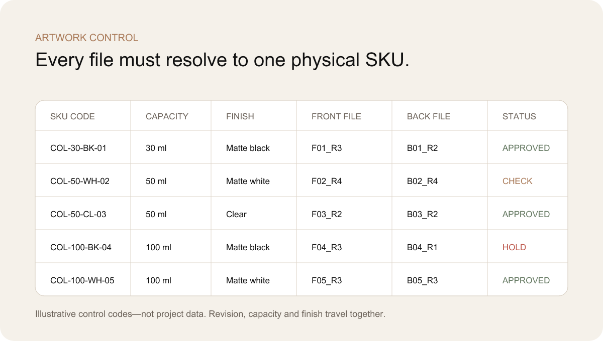
سلسلة رسائل البريد الإلكتروني ليست نظامًا للتحكم. فأسماء الملفات مثل “final” و“final-new” و“final-approved-2” لا تحدد أي تصميم ينتمي إلى أي سعة أو شكل أو سوق. وقد تطلب المشروع إنشاء مصفوفة تربط رمز SKU واحد بحجم الزجاجة، وشكلها، وملف التصميم الأمامي، وملف التصميم الخلفي، وعملية الزخرفة، وحالة المراجعة والموافقة. ولا يمكن إصدار ملف الإنتاج إلا بعد اكتمال الصف.
اعتمد تحديد موضع العناصر التصميمية على قواعد تصميمية بدلاً من التخمين البصري العشوائي. يمكن محاذاة الشعار مع منطقة بصرية محددة تُقاس انطلاقاً من سمة ثابتة في الزجاجة. وقد يظل حجم النص ثابتاً عبر مختلف السعات، أو يتغير ضمن نطاق محدد، وفقاً لنظام العلامة التجارية. وكان الجوهر هو تحديد المنطق. فقد يبدو نسخ بُعد مطلق واحد إلى كل زجاجة أمراً خاطئاً؛ كما أن توسيط كل عنصر تصميمي بالعين المجردة قد يؤدي إلى حدوث انحراف.
كما فصلت المصفوفة بين الموافقة على المحتوى وجدوى العملية. فقد وافقت فرق العلامة التجارية والفرق التنظيمية على النص والتسلسل الهرمي. وأثبتت تجارب الزخرفة صحة سماكة الخطوط، ونقل الرقائق المعدنية، ودرجة تغطية الحبر، ودقة التوافق، وقوة الالتصاق على السطح الفعلي. ولا يُثبت وجود ملف PDF صحيح أن الخطوط المعدنية الدقيقة يمكن تكرارها على زجاجة منحنية غير لامعة. وكان من الضروري الحصول على كلا الموافقتين.
قبل بدء الإنتاج، كان يتم إجراء تحقق بصري للتأكد من تجميع العناصر التالية: صورة محاكاة للزجاجة أو صورة فوتوغرافية، واللمسة النهائية، والتصميمات الأمامية والخلفية، وطبقات العملية، والمراجعات، ورمز SKU. ولم تكن تلك الخطوة مجرد إجراء شكلي في إدارة المشروع، بل كانت تضمن توحيد هوية المنتج بين أقسام المشتريات والإنتاج والتفتيش والتعبئة.
قد يستهلك برنامج متعدد وحدات التخزين (SKU) الميزانية والوقت المحدد في الجدول الزمني إذا تم إنتاج كل تركيبة ممكنة في البداية. فهذا النهج ينتج عنه العديد من العينات، لكنه لا يوفر سوى القليل من الدروس المستفادة. وعندما يتغير التشطيب أو واجهة الغطاء أو موضع التصميم الفني، قد تضطر العلامة التجارية إلى تكرار التصحيح نفسه على مجموعة العينات بأكملها.
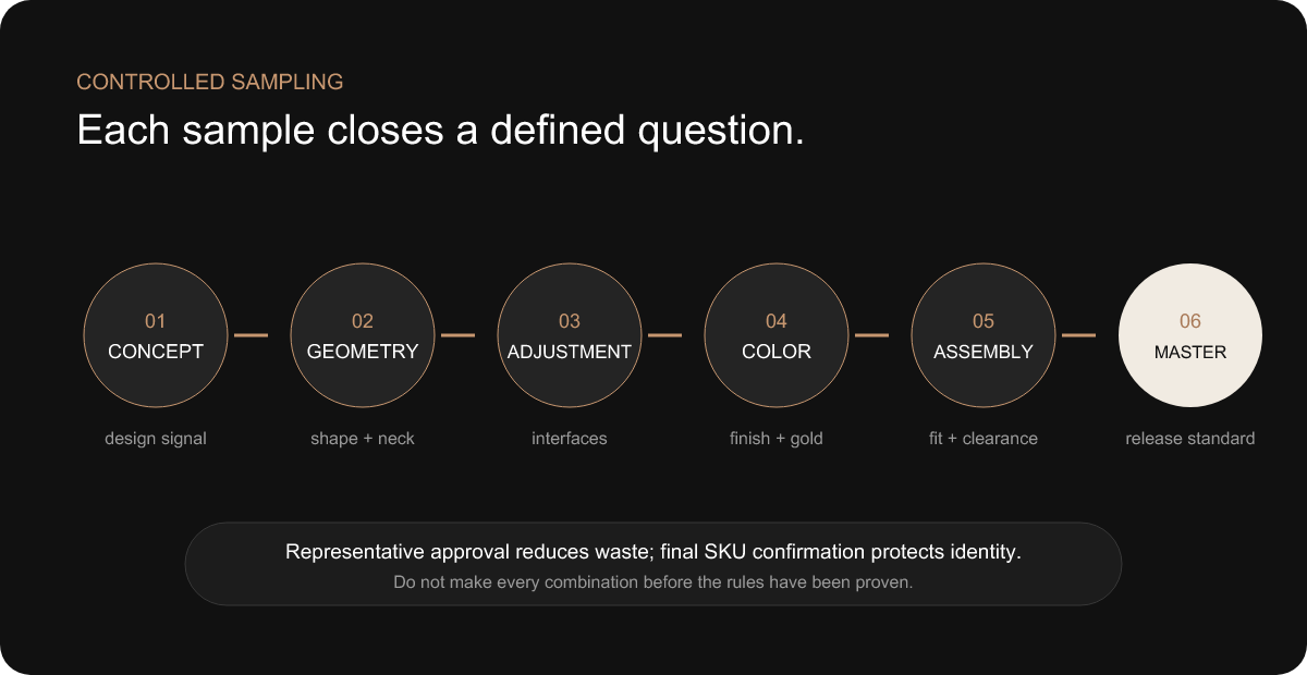
وكان البديل هو الحصول على موافقة الممثلين. تم اختيار العينات الأولى بهدف اختبار النظام: عينة تُظهر النسبة بشكل أفضل، وعينة ذات سطح كبير تكشف عن التباين في الطلاء، وزجاجة صغيرة لاختبار مساحة الشعار، وزجاجة سوداء لاختبار التباين مع اللون الذهبي، وزجاجة بيضاء لاختبار التعتيم، وغطاء مُركَّب يمثل الفجوة الأكثر حساسية في الغطاء. وكانت كل عينة مصحوبة بسؤال مكتوب.
تمت مراجعة الجوانب الهندسية قبل النظر في التنوع الزخرفي. ويمكن أن تحدد الزجاجة الأولى أو العينة النموذجية التي تمثل القالب نسب الجسم، وعلاقة العنق بالجسم، وشكل الزجاجة عند الوقوف، وشكل غلاف الإغلاق. وأُجريت تعديلات هندسية، في حين أن عدد القرارات اللاحقة التي تعتمد على الشكل كان أقل. ثم أُجريت تجارب التشطيب لمقارنة النماذج المرجعية باللون الأسود والأبيض وأي نماذج شفافة تحت إضاءة خاضعة للرقابة. وشملت اختبارات التجميع دمج الزجاجة والمضخة والطوق والغطاء. وحددت تجارب التصميم الفني سماكة الخطوط ومواقعها. ولم يتم تطبيق مجموعة وحدات التخزين (SKU) المتبقية إلا بعد أن استقرت تلك المعايير.
لم تحل الموافقة التمثيلية محل التأكيد النهائي لرقم SKU. فكل عطر كان لا يزال يتطلب تحديد هويته بشكل صحيح، وتخصيص النصوص والتصميمات الفنية له. وأي حاوية ذات شكل هندسي فريد كانت تحتاج إلى مراجعة أبعادها وطريقة تجميعها. وأي تشطيب أو عملية لم ترد في المجموعة المعتمدة كانت تحتاج إلى دليل مادي خاص بها. وقد فصلت الاستراتيجية بين أسئلة يمكن الإجابة عليها مرة واحدة لكل أسرة من الأسئلة التي يجب الإجابة عليها بالنسبة لكل SKU.
وقد جعل ذلك عملية أخذ العينات عملية ذكية من الناحية التجارية. فقد كانت العينة مفيدة عندما كانت تزيل خطرًا أو تُفرض اتخاذ قرار. فالعينة المثالية التي تكتفي بتكرار حالة تمت الموافقة عليها بالفعل تضيف قيمة أقل من العينة الصعبة عمدًا التي تكشف عن مشكلة في التوافق قبل بدء الإنتاج. ولذلك، كان نظام تتبع العينات الخاص بالفريق يسجل السؤال، والأدلة، والقرار، والمسؤول عن الموافقة، والتأثير على وحدات التخزين الأخرى (SKUs).
يمكن تحديد بنية العنق/المضخة، ولغة تصميم الغطاء، واللمسة الذهبية، ومنطق وضع الشعار، من خلال نماذج تمثيلية مختارة.
تظل مسؤوليات تحديد اسم العطر، والنص التوضيحي على الغلاف الخلفي، والرمز الشريطي، ومحتوى السوق، وتحديد السعة من اختصاص مستوى وحدة التخزين (SKU).
تتطلب أي ركيزة جديدة أو عملية جديدة أو تصميم هندسي جديد أو شرط جديد من المورد تقديم أدلة داعمة، بدلاً من الاعتماد على الموافقة المسبقة.
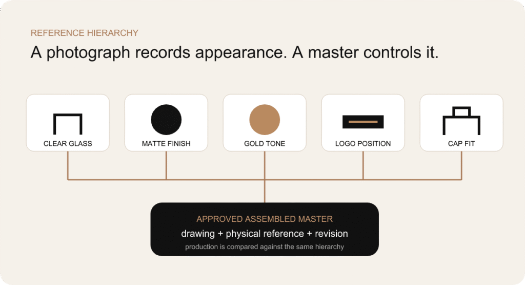
التسلسل الهرمي للمراجع. تحتوي النسخ الأصلية المادية على معلومات تتعلق بالسطح والتجميع لا يمكن للصور الفوتوغرافية أن تحفظها بشكل موثوق.
يمكن التحكم في بعض خصائص التغليف بشكل جيد من خلال الرسومات والملفات الرقمية. وتدخل السعة، والأبعاد الحرجة، ومسارات التصميم الفني، ورموز SKU ضمن المواصفات الموثقة. أما الخصائص الأخرى — مثل الملمس غير اللامع، والانعكاسية المعدنية، وملاءمة الغطاء عند اللمس، والعلاقة البصرية للعبوة المُجمَّعة — فتفقد معلومات مهمة عند تحويلها إلى صورة فوتوغرافية.
وقد ربط نظام النماذج المعيارية بين هذين النوعين من الأدلة. فقد مثلت الزجاجة الشفافة المعتمدة المظهر والهندسة المقبولين للزجاج. أما النماذج المعيارية ذات اللونين الأبيض والأسود فقد مثلت اللون والعتامة واللمعان والملمس. ووفرت النموذج المعياري الذهبي معيارًا مرجعيًّا بصريًّا مشتركًا بين المواد المختلفة. كما حددت النموذج المعياري التصميمي الموضع والحجم وسلوك العملية. وأظهرت النموذج المعياري المُجمَّع ملاءمة الغطاء وظهور الحافة والعلاقة العامة المعتمدة.
يُعدّ الكائن المادي الذي لا يخضع لمراجعة ما أمرًا غامضًا. ولذلك، كان لا بد من وضع علامة على العينة وربطها بالرسومات والأعمال الفنية الخاضعة للرقابة. وبالمثل، لا يمكن للرسم الذي يفتقر إلى الكائن المعتمد أن يعبر عن كل السمات الحسية. وقد شكّلت هذه العناصر معًا معيار الإصدار: ماهية المكون، وكيف ينبغي أن يبدو وملمسه، وأي إصدار هو المرجع المعتمد.
فيما يتعلق بالمجموعات التي تضم العديد من وحدات التخزين (SKU)، حالت البنية الهرمية دون تكرار العينات. فقد كان بإمكان نموذج رئيسي واحد باللون الأسود أن يشمل عدة أعمال فنية شريطة أن تكون الركيزة وظروف العملية متطابقة. كما كان بإمكان نموذج رئيسي واحد للإغلاق المُجمَّع تحديد الفجوة المفضلة، في حين كانت التجميعات الخاصة بكل حجم تتأكد من أن المجموعة قد حققت ذلك. وكان النموذج الرئيسي بمثابة عقدة تحكم، وليس قطعة متحفية.
تختلف منطقية الدُفعات الاقتصادية باختلاف عمليات التعبئة والتغليف. فقد يتطلب كل من إنتاج الزجاج، والطلاء، والطباعة، والمضخات، والأغطية المقولبة، والأجزاء المعدنية المطلية، والكرتون، حدًا أدنى مختلفًا للكمية. وقد يؤدي التعامل مع كل وحدة تخزين (SKU) على أنها مستقلة إلى تحويل مجموعة يمكن إدارتها إلى فائض في المخزون: فكل عطر له دفعة زجاجات خاصة به، ودفعة أغطية خاصة به، وإعدادات تزيين خاصة به، ودفعة كرتون خاصة به.
بدأ تحسين الحد الأدنى لكمية الطلب (MOQ) بالبحث عن القواسم المشتركة الخفية. فإذا كانت عدة وحدات تخزين (SKU) تشترك في قالب الزجاجة وعنقها، يمكن التخطيط للزجاج غير المزخرف كعائلة واحدة. كما أدى استخدام مضخة ومشغل وحلقة ربط مشتركة إلى تقليل عدد طلبات المكونات. وساهمت بنية الغطاء المشتركة في تركيز حجم أدوات التصنيع والتشطيب. ويمكن التمييز بين العطور من خلال التصميم الفني وبرامج السطح المختارة بدلاً من مضاعفة كل جزء هيكلي.
كما كان لتجميع الألوان دور مهم أيضًا. فقد يكون إنتاج جميع أشكال الزجاجات ذات اللون الأسود غير اللامع في تسلسل منظم أكثر كفاءة من التعامل مع اللون الأسود كطلب صغير منفصل لكل عطر. ويمكن تطبيق نفس المنطق على اللون الأبيض. ولا تزال الزخارف والتصميمات الفنية تقسم الدفعة إلى وحدات تخزين (SKU)، لكن التشطيب الأولي يتم التخطيط له على مستوى المجموعة بأكملها. ويعتمد ما إذا كان ذلك ممكنًا تجاريًا وتقنيًّا على مسار العملية الفعلي، ويجب التأكد من ذلك مع الموردين.
كان الإطلاق التدريجي خيارًا آخر في حالة عدم اليقين بشأن الطلب. فقد تقوم العلامة التجارية بإنشاء البنية الكاملة، لكنها تطلق السعة الرئيسية أولاً، ثم تضيف العبوات الصغيرة أو الأحجام الأكبر بعد تقييم ردود فعل السوق. ولا يكون هذا النهج مفيدًا إلا إذا تم تصميم الوحدة الأولى (SKU) مع مراعاة واجهات الاستخدام المستقبلية. فالزجاجة الأولى التي تحصر العلامة التجارية في تصميم فريد للعنق أو الغطاء أو الكرتون قد تجعل التوسع اللاحق أكثر تكلفة.
لم يكن المكون الفردي الأرخص هو بالضرورة الخيار الأقل تكلفة. فقد تتطلب مضخة أرخص سعرًا ذات ارتفاع تركيب مختلف استخدام طوق جديد وغطاء داخلي جديد. كما أن استخدام غطاء بحد أدنى من الكمية المطلوبة (MOQ) من مورد آخر قد يستلزم عملية تصنيع ثانية للذهب ومعيار فحص جديد. وتشمل التكلفة الإجمالية للمشروع تكاليف الأدوات، والعينات، والإعداد، ومراقبة الجودة، والمخزون الزائد، والتنسيق، والشحن، ومخاطر التأخير.
مبدأ التصميم التجاري
غالبًا ما تغيب الأعناق المشتركة والمضخات وأغلفة الأغطية عن اهتمام المستهلكين، لكنها تؤثر بشكل كبير على عمليات الشراء والتجميع. ويمكن للأجزاء المشتركة أن تحسّن التناسق وتجمع كميات الطلبات دون أن تجعل المجموعة تبدو عادية.
يمكن أن يظل التمييز المرئي واضحًا في أبعاد الزجاجة، والتشطيبات، والتصميم الفني، ومعالجة سطح الغطاء، والتغليف الخارجي. ويعتمد الحد المناسب على فكرة العلامة التجارية: تخصيص ما يمكن للمستهلك رؤيته أو الشعور به، وتوحيد الواجهات التي يجب أن تعمل بسلاسة دون لفت الانتباه.
لا تُعد القوالب دليلاً على الجدية. بل هي استثمار ينبغي أن يولد ميزة ذات مغزى وقابلة للتكرار. فقالب الزجاجة المصمم خصيصًا يمكن أن يضمن شكلًا مميزًا، أو توزيعًا مثاليًّا للوزن، أو لغة تصميمية خاصة بالشركة. كما أن الغطاء المصمم خصيصًا يمكن أن يخلق منتجًا يترك انطباعًا لا يُنسى عند لمسه. لكن تصنيع قوالب لكل سعة ومكون قبل أن تثبت فعالية بنية المجموعة قد يؤدي إلى تكبد تكاليف في ميزات لا يلاحظها المستهلك إلا بالكاد.
قارن المشروع بين ثلاثة مسارات. فقد وفرت مجموعة الزجاجات الجاهزة أسرع مسار للتحقق من جودة التشطيب والتصميم الفني والغطاء واستجابة السوق. أما المسار شبه المخصص، فقد جمع بين هيكل زجاجي موجود بالفعل مع غطاء أو زخرفة أو علبة مميزة. أما المسار المخصص بالكامل، فقد أدى إلى ابتكار شكل هندسي جديد للزجاجة وربما عناصر جديدة للغطاء. وتم تقييم كل مسار بناءً على القيمة التصميمية، والمخاطر الفنية، والحجم، والتوقيت، وخطط وحدات التخزين (SKU) المستقبلية، وإجمالي الاستثمار في العبوة.
كان يتم النظر في الزخرفة قبل عملية التشكيل، حيث يمكن أن تبرز العلامة التجارية بفعالية. فالطلاء غير اللامع، والشعار المعدني المصمم بعناية، والتصميم المنضبط للغطاء، كلها عناصر يمكنها أن تغير مظهر زجاجة موجودة بالفعل تتمتع بتناسب جيد. وعلى العكس من ذلك، إذا كان الشكل الخارجي للزجاجة بحد ذاته هو العلامة المميزة الرئيسية للعلامة التجارية، فلن تستطيع الزخرفة أن تحل محل القالب المصمم خصيصًا. ولم يكن السؤال المطروح هو “هل يمكن تخصيص هذا التصميم؟” بل “هل سيؤدي هذا التخصيص إلى تحسين التعرف عليه من قبل المستهلكين بدرجة كافية لتبرير تكاليف التصميم ومتطلبات الإنتاج؟”
كما تم ترتيب تسلسل قرارات تصنيع القوالب. فلا ينبغي الانتهاء من تصميم الغطاء الخارجي المخصص قبل تحديد منصة المضخة والارتفاع بعد التركيب. ولا ينبغي تصنيع قالب جديد للملحق الكرتوني بناءً على تصميم مثالي. وينبغي أن تخضع قوالب الزجاجات بجميع سعاتها لمراجعة موحدة، حتى لا يكشف القالب الثاني عن قاعدة تناسب غائبة في القالب الأول.
المكوّن | شفافية المعلومات للمستهلكين | المخاطر الفنية | قيمة التخصيص | التوصية |
شكل الزجاجة | مرتفع جدًّا | مستوى عالٍ: الشكل، توزيع الزجاج، الوزن، وتناسق العنق | تكون القيمة عالية عندما يكون الشكل هو السمة المميزة الرئيسية للعلامة التجارية | لا يتم إنشاء الأداة المخصصة إلا بعد تحديد هندسة العائلة وحالة الحجم. |
تشطيب الرقبة | منخفض بعد التجميع | مستوى عالٍ جدًّا: التوافق بين المضخة وعملية التعبئة | منخفض عادةً | يجب الالتزام بالمعايير ما لم تبرر متطلبات التعبئة أو التصميم الموثقة إجراء أي تغيير. |
منصة المضخة | الحجم المتوسط أثناء الاستخدام | مستوى عالٍ جدًّا: الإحكام، والجرعة، والارتفاع، والتركيب | خبرة متوسطة في مجال الرش | اختر عائلة مجربة؛ وقم بتخصيص معالجة المشغل المرئي بعناية. |
الجزء الخارجي للغطاء | مرتفع جدًّا | متوسط إلى مرتفع: الثبات، الوزن، الخلوص، التشطيب | إمكانات عالية من الناحية اللمسية والبصرية | استثمر في المجالات التي يُعد فيها الغطاء سمة مميزة؛ وحافظ على التحكم في الواجهة الداخلية. |
طوق | منخفض إلى متوسط | في أعلى مكدس الارتفاعات | عادةً ما تكون معتدلة | توحيد شكل المظروف والتشطيب؛ وتجنب الاختلافات الزخرفية التي تخلق ارتفاعات جديدة. |
الديكور | عالية | المعايير: الالتصاق، والتوافق، والعتامة، وقابلية التكرار | مستوى عالٍ مع اضطراب هيكلي منخفض نسبيًا | استخدامه كعامل تمييز رئيسي لرقم SKU بعد إجراء تجارب عملية مادية. |
التجزئة صندوق | سعر مرتفع عند الشراء | المقاس: المقاس المناسب، الحماية، هوية الطباعة | مناسب جدًا لمقاطع الفيديو السردية ومقاطع فتح العبوات | قم بالتخصيص بناءً على الحزمة النهائية وأعد استخدام المنطق الهيكلي عبر مختلف الأحجام. |
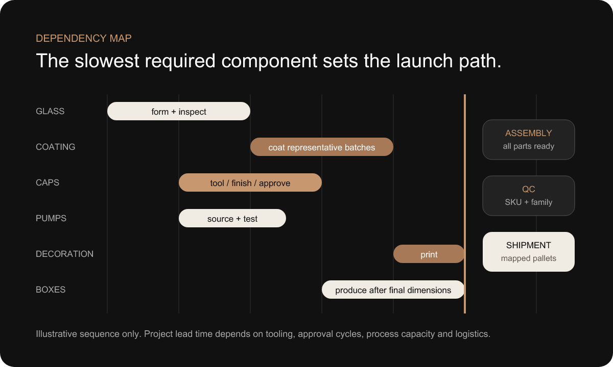
يعتمد إنتاج عبوة عطر كاملة على عمليات ذات جداول زمنية مختلفة. فقد يتطلب الزجاج إعداد القوالب وفترة إنتاج محددة. وتأتي عملية الطلاء بعد اعتماد الزجاج. ثم تليها عملية التزيين بعد الانتهاء من الطلاء بشكل صحيح. ويمكن البدء في تصنيع المضخات والأغطية بالتوازي بمجرد اعتماد الوصلات والتشطيبات. أما صندوق البيع بالتجزئة فيعتمد على الأبعاد النهائية الثابتة والتصميم الفني النهائي. وتنتظر عمليات التجميع ومراقبة الجودة والشحن اكتمال جميع المراحل المطلوبة.
ولذلك، ميز الجدول الزمني للمشروع بين الأعمال التي يمكن أن تبدأ مبكرًا وتلك التي قد تتطلب إعادة العمل إذا تم البدء فيها مبكرًا. ويمكن أن يبدأ توفير المضخات بمجرد استقرار شكل عنق الزجاجة واتجاه الجرعة. ويمكن أن تمضي أعمال هندسة الغطاء قدمًا مع توفر هيكل المضخة المركب. ويمكن إجراء تجارب الألوان باستخدام زجاج تمثيلي. ويمكن تطوير التصميم الجرافيكي للكرتون بالتوازي، لكن تصنيع القوالب الهيكلية وأبعاد الملحق النهائية تنتظر انتهاء تصنيع الزجاجة والغطاء.
كان المسار الحرج هو أطول سلسلة من المهام المترابطة اللازمة للشحن، وليس مجرد المكون الذي يستغرق إنتاجه أطول فترة زمنية وفقاً للعرض المقدم. فقد يستغرق إنتاج الغطاء وقتاً أطول من إنتاج التصميم الفني، ومع ذلك فإن التأخير في الموافقة على التصميم الفني قد يؤدي إلى تأخير عملية الزخرفة وتجهيز الصناديق الكرتونية. وقد يكون قالب الزجاجة جاهزاً، في حين أن التأخير في تغيير المضخة قد يستلزم إعادة النظر في قرارات تصميم الطوق والغطاء. وكان الجدول الزمني يحتاج إلى مسؤولين واضحين ومواعيد محددة للموافقة، وليس مجرد وعد متفائل بالتسليم.
كما ساهم التسلسل في الحفاظ على تناسق اللمعة المعدنية واللمعة غير اللامعة. وتم أخذ عينات من المكونات التي تستخدم تشطيبات ذهبية ذات صلة ومقارنتها قبل بدء عمليات الإنتاج بالجملة المنفصلة. وتم التخطيط لدفعات الطلاء بالأبيض والأسود مع مراعاة توفر المراجع. وأكدت اجتماعات ما قبل الإنتاج أي نسخة معدلة من التصميم الفني، والعينة الرئيسية، ودفعة المكونات التي تتحكم في كل مسار. وعندما كانت التبعيات واضحة، ساهم الإنتاج المتوازي في توفير الوقت دون تحويل حالة عدم اليقين إلى فائض في المخزون.
لا يتم هنا تحديد مدة موحدة للمشروع. فالمدة الزمنية تختلف باختلاف ما إذا كانت المسارات جاهزة أم مخصصة، ومدى تعقيد الأدوات، وعدد السعات الإنتاجية، وردود الفعل على العينات، وعمليات الزخرفة، والقدرة الإنتاجية، والخدمات اللوجستية. وينبغي على المشتري أن يطلب جدولًا زمنيًا قائمًا على الترابطات يوضح المواعيد التي يتعين فيها اتخاذ قراراته، وأي بند لم يتم حسمه بعد هو الذي يتحكم في موعد الإطلاق.
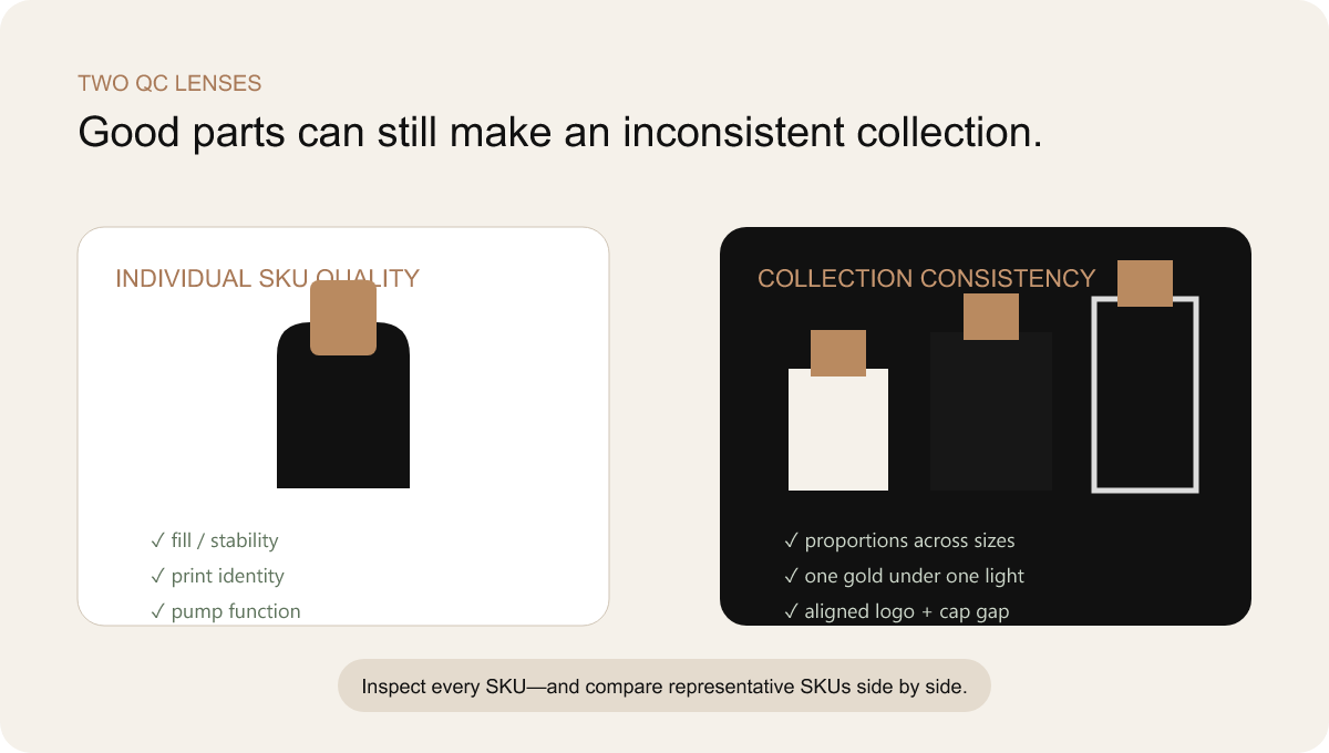
يهدف الفحص التقليدي إلى التحقق مما إذا كان المنتج الواحد يفي بمواصفاته. أما المجموعة التي تضم عدة وحدات تخزين (SKU)، فتطرح سؤالاً ثانياً: هل تظل المنتجات المقبولة كل على حدة متسقة عند مقارنتها ببعضها البعض؟ وكان هذا الاختلاف بين جودة المنتج الفردي والتناسق على مستوى المجموعة عنصراً أساسياً في خطة المراقبة.
لا تزال كل وحدة SKU تتطلب فحوصات خاصة بها: صحة الزجاجة وسعتها، والتشطيب، وهوية التصميم الجرافيكي، وملاءمة المضخة والغطاء، وموضع الزخرفة، وتكوين العبوة، والخصائص الوظيفية المطلوبة. فلا يمكن لـ“وحدة SKU النموذجية” أن تمثل كل شيء. فقد تجتاز الزجاجة البيضاء سعة 30 مل الاختبار، في حين أن الزجاجة السوداء سعة 100 مل قد تحمل ملصقًا خلفيًا خاطئًا أو فجوة غير مقبولة في الغطاء.
ثم أُجريت مقارنة أفقية لدراسة العلاقات بين العناصر. وُضعت الزجاجات السوداء ذات السعات المختلفة جنبًا إلى جنب لمقارنة اللمعان والعمق. وتم فحص الزجاجات البيضاء لتقييم درجة عتامتها. كما تم تقييم الأغطية والزخارف المعدنية تحت نفس الإضاءة. وتم فحص موضع الشعار على طول خط الأساس للرف. كما تمت مقارنة الفجوات بين الأغطية المُركبة والعلاقة بين الأغطية والكتف بين الأحجام المختلفة. وكشفت هذه الفحوصات عن انحرافات كان من الممكن أن يغفلها الفحص المكون تلو المكون.
واتبعت مراجع الفحص نفس التسلسل الهرمي الذي تم تحديده أثناء أخذ العينات: الرسومات والملفات الخاضعة للرقابة بالنسبة للخصائص القابلة للقياس أو التي يمكن تحديدها؛ والنماذج الأصلية المادية بالنسبة للخصائص الحسية والعلائقية. وكانت الصور الفوتوغرافية تدعم السجلات دون أن تحل محل العينات المعتمدة. كما احتاج فريق الجودة إلى الوصول إلى مصفوفة SKU بحيث يتم التعامل مع هوية المنتج الصحيحة كإحدى خصائص الجودة.
الجمهور في داكسين إدارة الجودة توفر هذه القدرة السياق الخاص بالشركة. ويجب التأكد من السجلات من صحة مراحل الفحص الخاصة بالمشروع، والمعدات، ومعايير القبول، والنتائج، قبل الإشارة إليها في تقرير منشور. ويتجنب هذا المسودة عمدًا ذكر معدل النجاح أو معايير الاختبار أو إحصائيات الرفض.
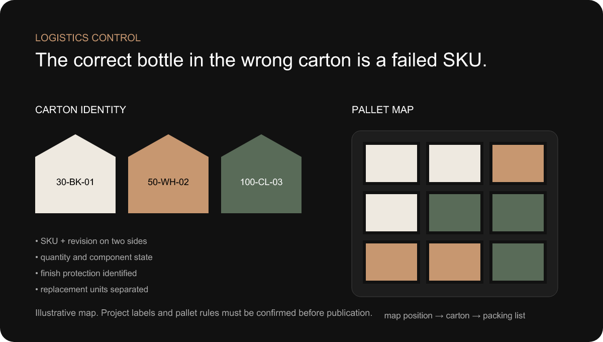
تشكل تعدد وحدات التخزين (SKU) مجموعة أخيرة من المخاطر بعد اكتمال عملية التصنيع. فقد يتم الخلط بين الزجاجات ذات الأشكال المتشابهة قبل عملية التزيين. وقد تدخل المنتجات النهائية في الصناديق الخاطئة. كما قد يتم تعبئة المضخات أو الأغطية أو الأطواق المنفصلة بكميات لا تتوافق مع عدد الزجاجات. وقد تصل المنصات المختلطة دون قائمة تفصيلية. وقد يتم دمج كمية البدائل في العدد الإجمالي دون أن يُلاحظ ذلك.
وبالتالي، تضمنت معلومات هوية الكرتونة رمز SKU المحدد، والوصف، والكمية، وحالة المكونات، ونسخة الإصدار عند الاقتضاء. وكانت الملصقات قابلة للقراءة من أكثر من جانب واحد، مما غنى فرق المستودع عن الحاجة إلى قلب كل كرتونة. وفي الحالات التي بدت فيها عدة منتجات متشابهة من خلال الغلاف الواقي، ساعدت الإشارات اللونية أو الرمزية في منع أخطاء الاختيار دون الحاجة إلى استبدال الملصق الرسمي.
تربط خرائط المنصات مواقع الكرتونات بقائمة التعبئة. وكان ذلك مفيدًا بشكل خاص عندما يحتاج العميل أو الجهة المسؤولة عن التعبئة إلى تسلسل تفريغ مخطط له، أو عندما تتشارك الأسواق أو العطور في حاوية واحدة، أو عندما تكون الوحدات البديلة منفصلة. وكانت المنصات المختلطة تُعامل على أنها تكوين متعمد وليس مجرد ارتجال أثناء التحميل.
صُممت الحماية بحيث تراعي السطح المزخرف النهائي. وكان لا بد أن تمنع الفواصل والأغلفة والصواني والعلب الورقية التلامس بين قطع الزجاج، وتآكل الأغطية، والضغط على الزخارف المعرضة للتلف. ويجب أن تكون العبوة آمنة، حيث إن الزجاج الشفاف قد يتعرض للخدش بعد الطلاء غير اللامع أو الطباعة المعدنية. كما كانت الصناديق المخصصة للبيع بالتجزئة بحاجة إلى الحماية من التكسير والاحتكاك أثناء التصدير.
إن الزجاجة الممتازة التي يتم تسليمها في صندوق يحمل رمز SKU خاطئًا تظل مشروعًا فاشلاً. ولذلك، استخدم قسم مراقبة اللوجستيات نفس المصفوفة المستخدمة في قسم التصميم والإنتاج، مما أدى إلى إغلاق السلسلة بدءًا من الهوية الرقمية وصولاً إلى الشحنة المادية. شركة داكسين خدمات التوصيل والتخزين وهو المورد الداخلي الطبيعي للمشترين الذين يقومون بتقييم هذه المرحلة.
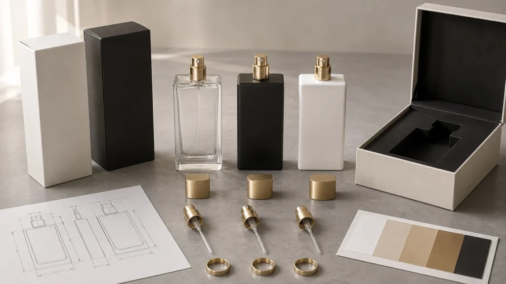
تصور مفاهيمي — وليست صورة للمشروع. يربط النظام النهائي مجموعة الزجاجات ومكونات الأغطية ومواصفات التشطيبات والرسومات والتغليف الخارجي في إطار هيكل موافقة واحد.
لم يكن الحل النهائي محدداً بعنصر واحد بارز. بل استمد قيمته من العلاقات المنظمة: مجموعة زجاجات مترابطة بمختلف السعات؛ ومنصة موحدة للعنق والمضخة حيثما كان ذلك متوافقاً؛ وتصميم متناسق للطوق والغطاء؛ ومعايير مادية للألوان الأسود والأبيض والذهبي؛ وتصميمات فنية مرتبطة بمصفوفة وحدات التخزين (SKU)؛ وعملية توزيع العينات على مراحل؛ ومراجع رئيسية؛ وتدفقات إنتاج متزامنة؛ وعمليات فحص الجودة على مستوى المجموعة؛ وتعبئة التصدير المخططة.
حافظت هذه البنية على التنوع الظاهر. فقد كان من الممكن استخدام أسماء مختلفة للعطور، ونصوص إعلانية متنوعة، ومعالجات سطحية مختارة. كما كان من الممكن تكييف السعات وفقًا لأدوارها. وكان من الممكن أن تدعم العبوات الخارجية قصصًا تسويقية مختلفة. ومع ذلك، ظلت المنصة الميكانيكية الخفية ولغة الموافقة ثابتتين بما يكفي للحفاظ على تماسك المجموعة.
كما ساهم النظام المتكامل في جعل عملية التكرار أكثر فائدة. فإذا فشلت مقارنة الذهب، كان الفريق يعرف المرجع الذي استند إليه القرار. وإذا كان الغطاء مرتفعًا، كانت سلسلة التفاوت تحدد الأبعاد والمكونات المعنية. وإذا تغير التصميم الفني، كانت مصفوفة SKU تُظهر كل النتائج المتأثرة. وهكذا أصبحت المشكلات قرارات قابلة للتتبع بدلاً من مجرد طلبات عامة بـ“جعلها متطابقة”.”
توضح الصورة التوضيحية أدناه منطق الموافقة هذا. وهي ليست دليلاً وثائقياً من المشروع الذي تم إخفاء هويته. قبل النشر، يجب على شركة DAXIN استبدال الصور التوضيحية أو استكمالها بصور فوتوغرافية مؤكدة للمشروع: مجموعة الزجاجات، وعينات التشطيبات المادية، والأغطية المُجمَّعة، ومقارنة الجودة، والتعبئة المخصصة للتصدير، على أن يتم التأكد من عدم وجود أي مخالفة لسرية العميل في كل منها.
تقلل تقنيات «الرقبة» و«المضخة» و«غلاف الياقة» و«الغطاء» من الحاجة إلى إجراء عمليات متكررة للتأكد من التوافق.
تُشكل السعة، والتشطيب، والتصميم الفني، والقصة التي يرويها الغلاف عوامل تمييز بالنسبة للمستهلك.
تساعد النسخ الأصلية والمراجعات ومصفوفة SKU في عمليات إعادة الطلب والإضافات المستقبلية.
لم يتم الإدلاء بأي عائد رقمي على الاستثمار، لأن السجلات الخاصة بالمشروع اللازمة لإثبات ذلك لم تُقدَّم. ومع ذلك، يمكن وصف القيمة التجارية النوعية من خلال البنية نفسها.
أصبحت تعقيدات عملية التطوير أكثر وضوحًا. فقد أصبح بإمكان العميل التمييز بين القرارات المتعلقة بالعلامة التجارية وتلك المتعلقة بالواجهة، ورؤية أي موافقة تؤثر على عدة وحدات تخزين (SKU). وحصل قسم المشتريات على خريطة مكونات أوضح، بدلاً من التعامل مع كل عطر على أنه قائمة مواد منفصلة. كما ساهمت المضخات المشتركة، ومنطق الإغلاق، ومراجع التشطيبات في تقليل عدد المعايير الفريدة التي كان يتعين الحفاظ عليها.
تمت معالجة مخاطر التوافق في وقت سابق. وتم مراجعة العنق والمضخة والطوق والغطاء كسلسلة مجمعة بدلاً من اكتشافها في مرحلة التجميع النهائي. وانتقلت قرارات الألوان من المناقشات الرقمية إلى المراجع المادية. وتم ربط هوية التصميم الفني بالإنتاج والتعبئة. وأظهر الجدول الزمني الترابطات، مما سمح بمواصلة العمل بشكل متوازٍ مع حماية العناصر التي تتطلب قرارًا مستقرًا في المراحل الأولية.
وقد تحسّن مظهر الرفّ بفضل مقارنة المجموعة ككل. فقد تم تقييم التناسب، واللون الذهبي، واللمسة غير اللامعة، وموضع الشعار، والفجوات بين الأغطية، من خلال المقارنة المباشرة. وأصبح الاتساق العالي الجودة نتيجة ملموسة مدعومة بأمثلة مرجعية، وليس مجرد أمل ذاتي في أن تتطابق الأجزاء التي تم شراؤها بشكل منفصل.
أصبح تقييم التوسع المستقبلي أسهل. فقد أصبح من الممكن إدخال عطر جديد في نظام التصميم الفني والتشطيب. كما أصبح من الممكن أن تستفيد السعة الجديدة من منصة العنق والإغلاق، مع إجراء دراسة مدروسة للنسب. ويمكن أن تستند طلبات إعادة الطلب إلى نماذج أساسية خاضعة للرقابة ومراجعاتها. ولم تقضِ هذه البنية على أعمال التطوير؛ بل حالت دون أن تبدأ كل إضافة من الصفر.
كما تم تبسيط عملية التنسيق بين الموردين. فبدلاً من مطالبة كل مورد بتحسين جزء منفصل، حددت بنية مشروع واحدة النتيجة النهائية للتجميع. وهذا هو الفرق بين شراء المكونات وتطوير حل لتغليف العطور. ولا تكمن القيمة في أن كل عملية تتم داخل مبنى مادي واحد، بل في أن هناك من يتولى تحديد الحدود الفاصلة بين العمليات.
وقد أسفر إطار العمل الخاص بالمشروع عن دروس يمكن تطبيقها على أنماط أخرى من الزجاجات. وتُعد هذه الدروس مفيدة عند تقديم إرشادات لـ تصميم زجاجات العطور حسب الطلب الشريك، أو مقارنة عروض الموردين، أو التخطيط للعطر التالي قبل إطلاق العطر الأول.
قم بتخطيط شكل الزجاجة، والعنق، والمضخة، والحافة، والغطاء، والزخرفة، والتصميم الفني، والعلبة قبل الموافقة على أول نموذج مرئي للمنتج. فالترابطات بين هذه العناصر هي المكان الذي تظهر فيه عادةً التكاليف المتأخرة وحالات الفشل.
يمكن أن يؤدي استخدام عنق ومضخة مشتركتين إلى تحسين عمليات الشراء والتجميع والاتساق دون المساس بقيمة العلامة التجارية للتشطيبات أو التصميمات الفنية أو العبوات الخارجية.
غالبًا ما تحظى التصميمات المميزة، وملمس الغطاء، والزخرفة المنضبطة باعتراف أكبر مقارنةً بواجهة تقنية فريدة مخبأة تحت الغطاء.
لا يمكن تقييم اللمعان، والملمس، والانعكاس المعدني، وملاءمة الغطاء بشكل موثوق من خلال الشاشات غير المعايرة والصور الملتقطة بالهاتف.
لا يُنتج «ذهب رقمي» واحد «ذهبًا ماديًا» واحدًا. حدد معيارًا مرجعيًّا، وقارن الأجزاء الحقيقية تحت إضاءة خاضعة للرقابة، وحدد ما إذا كانت الاختلافات مقبولة أم متعمدة.
قد يجتاز كل من الزجاجة والمضخة والطوق والغطاء الفحص، في حين تفشل الفجوة الناتجة عن التجميع. تحقق من سلسلة الاختبارات في ظروف تمثيلية.
تسمية الملفات، ومراقبة المراجعات، وملصقات الصناديق، وخرائط المنصات النقالة ليست مجرد إضافات إدارية. فهي تحدد ما إذا كان المنتج المادي الصحيح سيصل إلى السوق الصحيحة.
قد يؤدي أي مكون ينتج أداة أخرى، أو تشطيبًا، أو دورة عينات، أو واجهة، إلى زيادة التكلفة الإجمالية حتى لو كان سعره الوحدوي المُقدَّر أقل.
الزجاجة الأولى تحدد المنصة. تأكد من أن عنقها، ومنطق الغطاء، وقواعد النسب، ونظام الموافقة يمكنها استيعاب السعات أو العطور المحتملة لاحقًا.
الاستنتاج الأكثر تعقيدًا هو أيضًا الأبسط: الجودة الفائقة لا تعني تعظيم التنوع. تبدو المجموعة فاخرة عندما يبدو كل قرار مرئي متعمدًا، وتعمل كل واجهة خفية بشكل متسق. يقلل الحد من التنوع غير الضروري من المساحة اللازمة لتنفيذ التفاصيل المهمة بشكل أفضل.
في بعض الأحيان. يجب أن تستخدم مجموعة الزجاجات نهايات عنق متوافقة، كما يجب التحقق من التوافق بين المضخة والطوق والغطاء المُركَّب لكل سعة. يمكن أن يحافظ الغطاء الخارجي الموحد على اتساق العلامة التجارية، لكن قد يتطلب الأمر تعديل الملحق الداخلي أو ميزة التثبيت أو الطوق في حالة اختلاف أكتاف الزجاجات أو ارتفاعات التركيب. لذلك، يجب أن تعني عبارة “نفس الغطاء” منصة أغطية خاضعة للرقابة، وليس افتراضًا يستند إلى المظهر. تحقق من خلوص الغطاء وقوة إزالته ومحاذاة الغطاء والفجوة المرئية بين الغطاء والزجاجة في كل زجاجة نهائية.
وغالبًا ما يمكن استخدام نفس عائلة المضخات عندما تكون تفاصيل عنق الزجاجة ومتطلبات توصيل العطر وعملية التعبئة متوافقة. وعادةً ما يتم تحديد طول أنبوب الغمر لكل زجاجة بحيث يصل الأنبوب إلى الموضع الصحيح دون أن يتجعد بشكل مفرط أو يؤدي إلى إخراج المنتج بشكل غير كافٍ. ولا تزال هناك حاجة إلى التأكيد على مستوى الزجاجة فيما يتعلق بارتفاع المضخة المركبة، وتوافق الحشية، والخلوص بين المشغل، وإعدادات التثبيت بالضغط أو بالبراغي. وتسهل العناصر المشتركة عملية الشراء واستكشاف الأعطال وإصلاحها، لكنها لا تلغي الحاجة إلى تحديد كل مجموعة نهائية.
ابدأ بتصميم رقمي، ثم قم بإنشاء عينات مادية على الركائز الفعلية واختر نموذجًا بصريًّا معتمدًا. فالطلاء البلاستيكي، والألمنيوم المصقول، والزاماك المطلي، ورقائق الختم الساخن تعكس الضوء بطرق مختلفة، لذا قد يكون من المستحيل تحقيق هوية بصرية مطابقة تمامًا. والهدف العملي هو الحصول على مظهر متناسق في ظل ظروف إضاءة ومشاهدة محددة. يمكن لمكون واحد أن يحدد المظهر الذهبي المطلوب؛ ثم يقوم الموردون بضبط اللمعان والدرجة اللونية وطريقة المعالجة لتتوافق مع ذلك. ويتم مقارنة الإنتاج بالمرجع المادي، ولا يتم تقييمه بناءً على الصور أو رموز الألوان فقط.
لا يوجد رقم موحد. تعتمد خطة العينات المناسبة على الظروف الفريدة لكل حالة. يمكن للعينات التمثيلية تحديد شكل الزجاجة، والطلاء بالأبيض والأسود، والزخرفة المعدنية، وملاءمة المضخة/الغطاء، وموضع التصميم الفني قبل أن تنتج العلامة التجارية كل تركيبة. ولا يزال من الضروري إجراء تأكيد نهائي لهوية كل وحدة تخزين (SKU)، ولأي سعة أو تشطيب أو مادة أساسية أو عملية لا تشملها المجموعة التمثيلية. وتُدرج الخطة المفيدة الأسئلة التي يجب أن تجيب عليها كل عينة؛ ولا تستهدف عددًا تعسفيًّا من العينات.
لا. فاستخدام زجاجات جاهزة أو مجموعة زجاجات موجودة بالفعل، مع التحكم في الطلاء والزخرفة ومعالجة الأغطية والتغليف الخارجي، يمكن أن يحقق تمييزًا قويًّا مع تقليل مخاطر القوالب والحد الأدنى للطلبات ومخاطر التوافق. ويكون تصنيع زجاجة مخصصة مبررًا عندما يخلق شكل الزجاجة أو هيكلها الزجاجي تمييزًا ملموسًا للعلامة التجارية، ويكون الحجم المتوقع كافيًا لدعم الاستثمار. وينبغي على العلامات التجارية مقارنة الخيارات المتاحة من الزجاجات الجاهزة وشبه المخصصة والمخصصة بالكامل على مستوى النظام ككل، بما في ذلك العينات والأغطية والمخزون الزائد والقدرات المستقبلية — وليس مجرد مقارنة أسعار الوحدة للزجاجات.
تقليل التباين الهيكلي غير الضروري. تقاسم المضخات والأطواق والأغطية حيثما أمكن ذلك؛ واستخدام عائلة واحدة من الزجاجات؛ وتمييز العطور من خلال التصميم الفني والزخرفة المنظمة؛ والتخطيط لدفعات طلاء مشتركة باللونين الأسود أو الأبيض؛ والنظر في استخدام زجاجة موجودة بالفعل قبل البدء في تصميم عدة قوالب. يمكن أن يؤكد الإطلاق التدريجي صلاحية السعة الرئيسية قبل إضافة أحجام السفر أو الأحجام الأكبر، شريطة أن يتم تصميم وحدة التخزين (SKU) الأولى كمنصة مستقبلية. تختلف الحدود الدنيا حسب المكونات والعمليات، لذا يجب على DAXIN مراجعة مصفوفة وحدات التخزين (SKU) الفعلية والكميات المتوقعة قبل التوصية بمسار معين.
الفجوة المرئية هي نتيجة عملية التجميع. فارتفاع عنق الزجاجة ومدى تناسقه، وارتفاع المضخة المركبة، وارتفاع الطوق، وتجويف الغطاء، وقطعة الإحكام، وحتى الطلاء النهائي، كلها عوامل يمكن أن تؤثر عليها. فقد يكون كل مكون ضمن حدود التفاوت المسموح بها الخاصة به، في حين أن تراكم هذه العوامل — سواء كانت مرتفعة أو منخفضة — يؤدي إلى ظهور فجوة غير مقبولة، أو اهتزاز الغطاء، أو ظهور الطوق، أو ملامسة المشغل. ويكمن الحل في إجراء مراجعة لتفاوتات التجميع مدعومة بعينات مادية ونموذج مرجعي بصري محدد، وليس مجرد تشديد الفحص على جزء واحد.
العينة النموذجية هي مرجع مادي معتمد مرتبط بالرسومات الفنية والمصمّمة والمراجعات الخاضعة للرقابة. ويمكن أن تمثل مظهر الزجاج الشفاف، أو اللمسة النهائية باللون الأسود أو الأبيض غير اللامع، أو اللون الذهبي، أو موضع الشعار، أو ملاءمة الغطاء، أو العبوة المجمَّعة بالكامل. وتُعدّ العينات النموذجية المادية ذات قيمة كبيرة بالنسبة للخصائص التي لا تنقلها الصور الفوتوغرافية بشكل موثوق، بما في ذلك اللمعان، والملمس، والانعكاسية، وملاءمة الملمس. ويجب أن تكون هذه العينات مُعلَّمة، ومحمية، ومخزَّنة بشكل مناسب، وأن يتم استبدالها بشكل مدروس عند حدوث أي تغيير معتمد.
استخدم مصفوفة SKU تربط كل رمز منتج بالسعة، والتشطيب، والملف الأمامي، والملف الخلفي، ومحتوى السوق، وعملية التزيين، وحالة المراجعة والموافقة. تجنب اختيار التصميمات الفنية للإنتاج من مرفقات البريد الإلكتروني أو أسماء الملفات “النهائية” الغامضة. طبق قواعد تسمية متسقة، وقم بإصدار تأكيد مرئي قبل الإنتاج يعرض الزجاجة، وموضع التصميم الفني، والمراجعات الحالية معًا. تعتبر الموافقة على المحتوى التنظيمي وجدوى عملية التزيين موافقات منفصلة؛ ويجب إكمالهما قبل الإصدار.
يعتمد الجدول الزمني على ما إذا كانت الزجاجات جاهزة أم مصنوعة حسب الطلب، ونطاق الأدوات المستخدمة، وتوافر الأغطية والمضخات، ومدى تعقيد التشطيب والزخرفة، وجولات أخذ العينات، وسرعة موافقة العميل، والقدرة الإنتاجية، والعمليات اللوجستية. ويُظهر الجدول الزمني الفعال الترابطات: ما يمكن تنفيذه بالتوازي، وما يجب أن ينتظر حتى يتم اعتماد الشكل الهندسي أو اللون، ومتى يتم تجميد التصميم الفني، وأي عنصر يتحكم في المسار الحرج. يجب على شركة DAXIN تقديم جدول زمني خاص بالمشروع فقط بعد مراجعة الملخص. ولا تنشر دراسة الحالة هذه مهلة إنتاج عامة.
يرجى إرسال الصور المرجعية أو الرسومات، والسعات المقصودة، والعدد المتوقع لرموز المنتجات (SKU)، ومعلومات عن الزجاجة أو عنقها إن توفرت، وتصميم الغطاء، ومتطلبات الرش، ومراجع الألوان والتشطيبات، وتصميمات الزخرفة، وكميات الطلبات المتوقعة، والسوق المستهدفة، وطريقة التعبئة، والفترة الزمنية المقررة لإطلاق المنتج. ولا يلزم أن تكون المواصفات كاملة. فالمراجعة المبكرة تساعد في تحديد العناصر التي يجب توحيدها، والمعلومات الناقصة، والقرارات التي يجب اتخاذها قبل البدء في تصنيع القوالب. والغرض من ذلك هو الكشف عن العوامل المترابطة بينما لا تزال هناك خيارات متاحة للمشروع.
سواء كنت بحاجة إلى زجاجة جاهزة أو حل تغليف مخصص بالكامل، فإن فريقنا المتمرس على أتم الاستعداد لدعم مشروعك — بدءًا من تصميم الزجاجة وتزيينها وصولاً إلى الأغطية والتغليف والتسليم.
 English
  Spanish
  French
  German
  Arabic
  Italian
  Dutch
Dutch  Portuguese
  Russian
  Korean
  Japanese