
In the competitive world of luxury fragrance, your bottle is your silent ambassador. While designers often focus on visual allure, true brand prestige demands flawless manufacturing and material science. A stunning design is worthless if the label bubbles on curved glass, its ink dissolves upon alcohol exposure, or it fails strict international compliance laws. This B2B blueprint bridges the critical gap between artistic vision and engineering reality. Designed for procurement directors and brand founders, this guide explores the essential anatomy of perfume label design, substrate selection, and advanced direct-to-glass decoration alternatives, ensuring your packaging survives the supply chain and captivates consumers.

Decoding the Anatomy of a Premium Perfume Label
In the ultra-competitive landscape of high-end perfumery, a label is never just a two-dimensional graphic design printed on a piece of paper. It is a highly engineered “industrial skin” that must survive aggressive chemical environments, adhere perfectly to irregular glass geometries, and instantaneously communicate unparalleled brand prestige. For B2B buyers, procurement directors, and cosmetic engineers, bridging the gap between artistic vision and manufacturing reality is the ultimate challenge. The anatomy of a premium fragrance label demands a rigorous three-dimensional packaging mindset.
Most novice brand founders obsess exclusively over the primary display panel (the visual tension of the front logo), completely neglecting the functional design of the bottom or back labels, as well as the mechanical tolerances required by high-speed label application machines. A successful B2B label strategy must balance aesthetic archetypes with strict industrial execution parameters.
To understand this, we must introduce the foundational terminology of print engineering. When designing a label, the Bleed Margin must be meticulously set to at least ≥ 3mm to ensure edge-to-edge color consistency during mass production. Furthermore, the Die-Cutting Tolerance is typically ± 0.5mm. If a designer creates a tight, intricate border that runs exactly along the physical edge of the label, this microscopic shifting during the die-cutting process will result in visibly asymmetrical borders, instantly degrading the perceived value of a luxury perfume.
Consider the physical and cognitive sandbox of a classic 50ml cylindrical perfume bottle. If the label design’s width exceeds the tangent arc of the cylinder (specifically, if the wrap angle is > 110°), the label substrate will constantly fight against the curvature. Driven by Newtonian rebound forces (the material’s memory to return to a flat state), the edges will eventually lift and curl, creating what the industry calls “flagging.” By calculating these physical limitations upfront, brands can realize that packaging is a precision engineering discipline where design dimensions cannot be dictated by imagination alone.
Aesthetic Archetypes in Fragrance Label Design
Visual inspiration must be anchored in consumer psychology and market positioning. When defining the label for a fragrance, B2B buyers and designers generally pivot between two dominant extremes: the stark, modern minimalist approach or the heavy, textured vintage aesthetic. Each style weaponizes different psychological triggers to capture distinct demographic segments.
The Psychology of Minimalist Typography and Negative Space
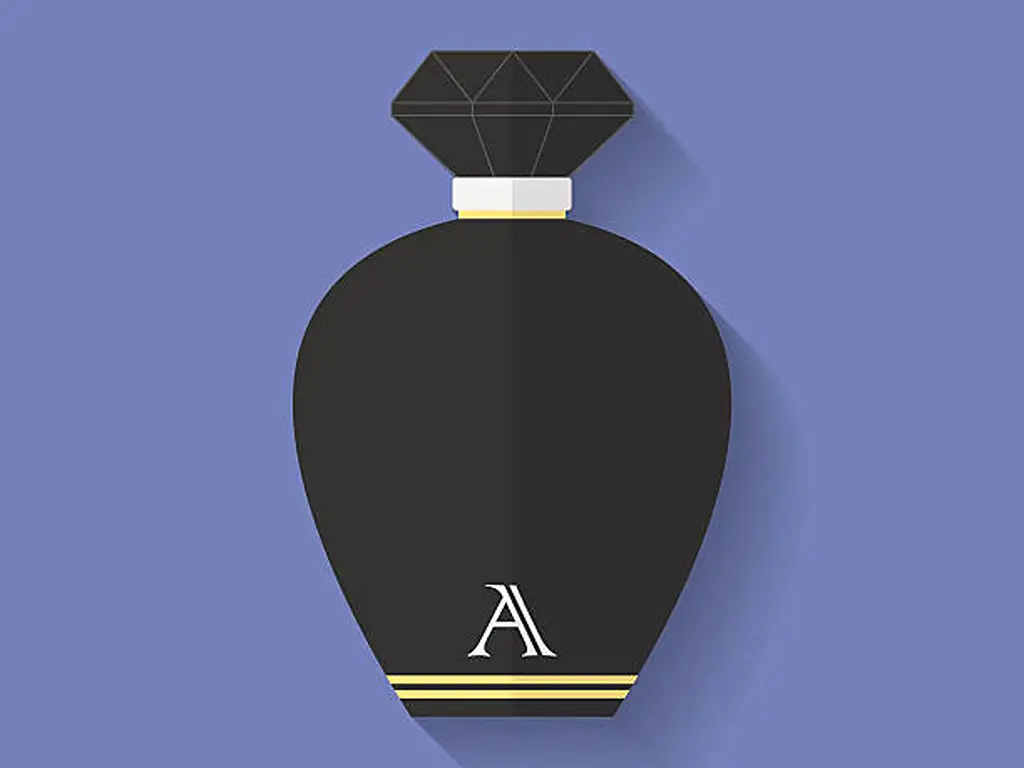
Pioneered by niche fragrance powerhouses like Byredo and Le Labo, the minimalist label is a masterclass in “non-design.” This approach heavily relies on an extreme Negative Space Ratio—typically curated between 60% and 75% of the total label area. But why does emptiness sell at a premium?
This utilizes the “Art Gallery White Wall Effect.” In a museum, the larger the expanse of blank white wall surrounding a single painting, the more important and expensive that artwork appears. On a perfume bottle, the void of the label serves to amplify the purity of the liquid inside and the mystery of the olfactory experience. It signals a quiet confidence, suggesting that the scent is so profound it requires no flashy marketing.
Executing this requires absolute typographic precision. Brands often lean on stark sans-serif typefaces like Helvetica Neue or Akzidenz-Grotesk. However, the true test of manufacturing comes down to Micro-printing limits. Because the design is so sparse, the mandatory legal text must be shrunk significantly without losing legibility. The absolute limit for micro-printing on cosmetic labels is 4pt font; anything smaller will suffer from ink spread (dot gain) and become an illegible blur, leading to compliance failures.
Elevating Brand Equity Through Luxury and Vintage Textures
On the opposite end of the spectrum lies the baroque, apothecary, or Art Deco aesthetic—a style that commands high price points through visual and tactile complexity. This involves intricate geometric borders, baroque heraldry, and heavily layered typographic hierarchies.
The psychological mechanism here relies on historical anchoring. When a consumer encounters a label featuring a deeply embossed crest and classical serif fonts (such as Adobe Garamond or Caslon), the human brain instinctively associates these visual cues with “royal warrants,” “heritage,” and “Old World craftsmanship.” This instantly rationalizes a retail price north of $300.
However, from a B2B manufacturing standpoint, complex vintage designs are a minefield. The Line Weight of any heraldry or crest must be strictly monitored. The hard industrial limit is a minimum line weight of ≥ 0.15mm. If the designer creates foil stamping or embossing lines thinner than this, the hot foil will bridge the gaps, and the intricate crest will devolve into a muddy, unrecognizable blob of metallic ink during high-speed production.
Essential Legal Compliance and Mandatory Label Elements
Aesthetic brilliance means nothing if your product is seized by customs or pulled from retail shelves due to regulatory violations. For B2B buyers and global e-commerce sellers, compliance is the ironclad foundation of label design. Aesthetic layouts can never supersede legal mandates.
Deciphering Ingredient Lists and Allergen Disclosure Rules
Whether placed on the back of the bottle or on a bottom sticker, cosmetic regulations universally require specific mandatory elements. Every fragrance must display: the product identity, net contents, concentration indicator (e.g., Eau de Parfum), full ingredient list, country of origin, batch code, and the Period After Opening (PAO).
The ingredient list is heavily governed by the International Nomenclature of Cosmetic Ingredients (INCI) standards. For instance, if a brand highlights a natural botanical narrative using Italian Bergamot, the label cannot simply read “Bergamot Oil.” It must be legally declared as Citrus Aurantium Bergamia Fruit Oil.
Furthermore, under EU Cosmetic Regulation (EC) No 1223/2009, there are 26 specific fragrance allergens (such as Limonene, Linalool, and Citral) that must be explicitly disclosed in the ingredient list if their concentration exceeds 0.001% in leave-on products like perfume.
Crucially, there is a widespread industry misconception regarding expiration icons. Many novice designers mistakenly add the “Hourglass” (Best Before End – BBE) symbol to perfume labels. Under EU regulations, the hourglass is only required for products with a total lifespan of less than 30 months. Because perfumes contain extremely high concentrations of ethanol (typically 70% to 85%), they boast immense physical and microbiological stability, easily outlasting 30 months. Therefore, high-purity alcohol fragrances are completely exempt from BBE hourglass labeling. Brands must strictly use the Period After Opening (PAO) icon (the open jar symbol, typically marked as 24M or 36M).
Multi-Jurisdictional Regulatory Standards Across Major Markets
When a B2B brand intends to launch a product globally, the label must satisfy a matrix of conflicting international laws—primarily the US FDA (under the new MoCRA guidelines), the EU Cosmetic Regulation, and China’s NMPA (CSAR).
| Regulatory Domain | Net Content Declaration | Warning & Flammability | Responsible Person / Address |
|---|---|---|---|
| US (FDA / MoCRA) | Requires dual declaration (metric and imperial). E.g., 50 ml & 1.7 Fl. Oz. | Mandatory flammable warning required on outer packaging and primary container. | Requires domestic US address or phone/website for adverse event reporting. |
| EU (EC 1223/2009) | Metric only is acceptable (e.g., 50 ml or 50ml ℮). Imperial is optional but common. | Requires the flammable symbol (flame icon) and/or specific text warnings. | Must list an EU Responsible Person (RP) name and physical EU address. |
| China (NMPA / CSAR) | Metric mandatory. Over-labeling with a compliant Chinese sticker is standard for imports. | Requires standardized Chinese warning phrases regarding fire hazards. | Requires standard Chinese entity registration and filing numbers. |
A critical technical failure point for US-bound perfumes is typography sizing. A highly dangerous amateur mistake is using arbitrary Imperial volume units (like U.S. Gallons) or failing FDA height requirements. In the fragrance industry, volumes are strictly measured in Fl. Oz. (Fluid Ounces) and ml. Furthermore, the FDA Cosmetics Labeling Guide dictates that the minimum height for the net quantity declaration is based on the area of the Principal Display Panel (PDP). For the vast majority of 30ml to 50ml perfume bottles, the PDP area is under 5 square inches. Consequently, the legal minimum font height for the volume declaration is exactly 1/16 inch (approx. 1.6mm). For ultra-miniature sample vials (less than 1/8 ounce), the FDA grants exemptions allowing the mandatory information to be printed on an accompanying tag or tear-way card rather than the microscopic bottle itself.
Material Science: Selecting the Perfect Substrate for Fragrance Bottles
Navigating the material science of labeling is where procurement officers either build a robust supply chain or engineer a disaster. A fragrance label operates in an incredibly hostile chemical environment. It is constantly subjected to highly volatile denatured alcohol, essential oils, and friction from human hands.
Paper vs. Film Substrates for Superior Alcohol Resistance
The primary battle in substrate selection is between high-end textured art papers and synthetic polymer films (like BOPP, PET, or PE).
Uncoated textured art papers (like cotton or linen blends) offer unparalleled tactile warmth and a bespoke, artisanal aesthetic. However, untreated paper is a sponge. Its Cobb Value (the measure of water absorptiveness) is high. If a consumer sprays the fragrance and a drop of 80% concentration ethanol runs down the neck of the bottle onto a standard paper label, a catastrophic “capillary wetting phenomenon” occurs within 3 seconds. The alcohol dissolves the ink, causing the brand logo to bleed out like a watercolor painting.
Conversely, Bi-axially Oriented Polypropylene (BOPP) films—typically utilized in 50μm to 60μm weights—are chemically inert to ethanol. An ultra-clear BOPP label can create a seamless “no-label look.” If a brand absolutely demands the texture of paper, the supply chain must engineer an Oleophobic and Hydrophobic top-coat. This invisible chemical barrier ensures that stray alcohol beads up and rolls off the label without ever penetrating the cellulose fibers.
Specialty Textures and Metalized Foils for Premium Differentiation
For brands competing in the ultra-luxury ($250+) tier, standard substrates are often discarded in favor of extreme, high-density materials: thick metalized foils, genuine brass or pewter plates, and die-cut leather.
These materials serve a powerful psychological function. Consider a bespoke fragrance utilizing a 0.8mm thick electroplated brass label. By adhering this dense plate to the glass, it physically shifts the center of gravity of the bottle downward. When a consumer holds the bottle, this unexpected “heavy physical weight” and cold metallic touch bypass logical reasoning, translating directly in the mammalian brain to perceptions of extreme value and rarity.
However, the engineering challenge scales exponentially. Heavy metal plates require specialized Pressure Sensitive Adhesives (PSA). The balance between the adhesive’s Initial Tack (how quickly it grabs the glass) and its Cohesion (its internal strength to hold the heavy plate over years of temperature fluctuations) must be perfectly calibrated against the surface energy of the glass.
Engineering Compatibility: Label Adhesion vs. Direct Bottle Decoration
This brings us to the most critical mechanical hurdle in perfume packaging: the interface between the label and the glass geometry. This is the industrial trap where beautiful designs face catastrophic failure on the production line, causing massive delays and budget overruns.
Solving the Compound Curve Dilemma on Irregular Glass Surfaces
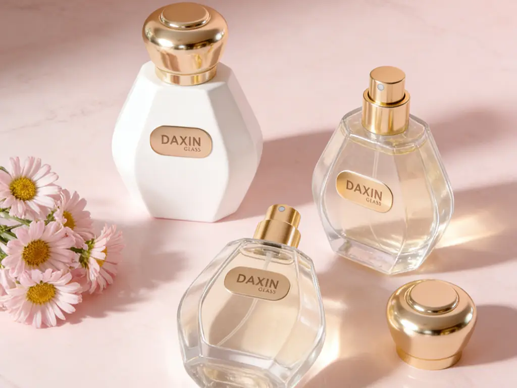
Many modern perfume bottles feature irregular, avant-garde geometries—spherical shapes, twisted polyhedrons, or dual-compound curves. Applying a flat, two-dimensional label to a three-dimensional compound curve is governed by strict physics.
Imagine trying to seamlessly tape a flat sheet of A4 paper around a basketball. No matter how much pressure you apply, the edges will inevitably fold, wrinkle, and trap air. This is the exact dilemma faced by automated labeling machines. On compound curves, labels will develop “pleats,” “dog-ears,” or massive air bubbles. To succeed, the glass Surface Energy must measure ≥ 38 mN/m, and the adhesive must pass the strict FINAT FTM 1 180° peel adhesion test.
But the true root cause of label bubbling is often poor glass mold precision. If the glass surface is wavy or uneven, no label in the world will sit flat. This is where high-end glass manufacturers like Daxin Glass completely alter the paradigm. Utilizing advanced Blow-and-Blow molding techniques combined with servo-motor gob weight control, Daxin restricts molten glass drop deviations to a microscopic ±0.5-1g. This extreme precision ensures that the bottle’s designated Label Panel is engineered with absolute flatness and uniform wall thickness, fundamentally eliminating the root cause of label bubbling at the very genesis of the glass manufacturing process.
The Ultimate Alternative: Direct Glass Decoration and Silk Screening
What happens when a brand’s aesthetic demands extreme durability that paper adhesives simply cannot guarantee against high-humidity oceanic shipping and concentrated alcohol spills?
For B2B procurement directors looking at the Total Cost of Ownership (TCO), the ultimate alternative to paper labels is Direct-to-Glass Decoration. While the unit cost of a paper label might seem cheap (e.g., $0.05), applying it to a complex curved perfume bottle often results in a production Scrap Rate of 15% to 20% due to misaligned or bubbled labels. When factoring in the cost of ruined glass, wasted perfume, and manual labeling labor, the true cost skyrockets.
By transitioning to Daxin’s fully automated, multi-color silk screening and hot stamping lines, brands realize a paradigm shift in TCO. For production runs exceeding 10,000 units, direct glass decoration eliminates manual labeling labor and drives the scrap rate to near zero, effectively lowering the Total Cost of Ownership by up to 12%.
More importantly, Daxin has formulated a proprietary Alcohol-Resistant Water-Based Polyurethane Emulsion for its silk screening process. Unlike standard inks that melt on contact with fragrance, this specialized coating easily survives a brutal 500-cycle high-concentration alcohol rub test while maintaining an extreme Cross-Hatch Adhesion score of ≥ 4B. Because it is water-based, it boasts virtually zero VOC (Volatile Organic Compound) emissions, perfectly complying with the most draconian EU and US environmental packaging regulations.
When this indestructible direct-print technology is applied directly onto Daxin’s signature Super Flint Crystal Glass—which boasts an iron content of <0.015% and an Optical Light Transmission of ≥ 91%—the result is an ultra-premium, monolithic piece of packaging art. The absence of any green tint in the glass ensures that the pure color of the perfume, combined with the seamlessly printed typography, creates a visual masterpiece that paper labels simply cannot replicate.
Structural Blueprint for Executing a Cohesive Packaging Strategy
The final phase of B2B packaging execution requires zooming out from the microscopic material parameters and viewing the product as a holistic architectural ecosystem. The label (or direct silk screen), the glass vessel, the pump mechanism, and the closure cap must operate in perfect aesthetic and functional harmony.
Think of luxury packaging like a bespoke three-piece suit: the glass bottle is the jacket, the label is the shirt, and a heavyweight Zamak (zinc alloy) cap is the tie. If the bottle features a soft, matte frosted finish, but the label utilizes a cheap, high-gloss synthetic film without color coordination, the visual dissonance immediately betrays a lack of brand sophistication.
To execute a flawless rollout, procurement and design teams must adhere to a strict structural blueprint:
- Pantone (PMS) Color Matching: Ensure that the specific hex codes used in the digital label design are perfectly matched to physical Pantone swatches, aligning the ink on the bottle with the dyed inner liner of the secondary carton.
- Machine Tolerances: If utilizing traditional roll labels, ensure the backing paper includes an Eye-Mark tracking spacing of ≥ 2mm, allowing high-speed optical sensors on the filling line to perfectly index and align every label.
- Physical Prototyping: Never move from 2D renders directly to 100,000-unit mass production. Insist on physical Golden Samples to test how the specific adhesive interacts with the actual glass surface energy over a 7-day thermal aging cycle.
Stop wasting your production budget and brand equity on the wrong substrates, incompatible adhesives, and high labeling scrap rates. The transition to flawless packaging begins with structural foresight. Contact the Daxin Glass packaging engineering team today for a comprehensive Design for Manufacturability (DFM) Audit. Secure your custom 3D printed prototypes and explore exactly how high-precision glass molding and alcohol-resistant direct silk screening can elevate your brand’s physical presence and lower your total cost of ownership.

 English
  Spanish
  French
  German
  Arabic
  Italian
  Dutch
Dutch  Portuguese
  Russian
  Korean
  Japanese