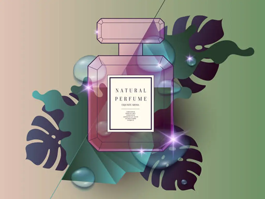
Product packaging has gone beyond its utilitarian role in the hyper-competitive world of the beauty industry. It is no longer a ship; it is a living brand ambassador, the main storyteller, the silent salesman on a busy digital and physical shelf. In the case of skincare products, where claims of effectiveness and purity are most important, packaging serves as the initial handshake with the customer, a physical expression of the brand’s ethos. This guide will explore the major trends in skincare packaging design that are defining the industry, beyond short-lived aesthetics, to the values, stories, and sensory experiences that engage the modern consumer. The point is to learn these currents not as the rules to be adhered to, but as the instruments of strategy to create a resonant brand image and ensure brand loyalty.
The Conscientious Consumer: Sustainability as the Foundation

The single most dominant force in cosmetic packaging design today is the consumer’s heightened awareness of environmental concerns. Sustainability is no longer a niche preference but a foundational expectation. A brand’s commitment to greener solutions is scrutinized, and its environmental impact is a critical factor in purchasing decisions. This shift demands that beauty brands, both new and established, integrate sustainable practices into the very core of their product packaging design. Great skincare packaging design is now synonymous with responsible design.
The Circular Economy in Action
The concept of a circular economy has moved from theory to tangible practice. The most forward-thinking beauty packaging strategies now prioritize systems that eliminate waste. Refillable containers are at the forefront of this movement, offering a premium user experience while fundamentally altering the consumption cycle. This approach requires durable packaging, often made from glass or aluminum, that is designed for longevity. Simultaneously, there is a strong push towards monomaterial packaging. By constructing a container from a single material, brands drastically simplify the recycling process, increasing the likelihood that the package will be successfully reclaimed. Finally, the use of PCR (Post-Consumer Recycled) content has become a key indicator of a brand’s commitment. Incorporating recycled plastics, glass, or paper demonstrates a tangible investment in reducing virgin material consumption.
Innovations in Eco-Materials and Formats
In addition to recycling, the industry is also developing materials that will reduce the environmental footprint from the very beginning. An end-of-life solution is biodegradable materials, which are made of corn starch or mycelium. This biodegradable packaging discovery is a strong desire to solve the plastic burden on the planet. Similar to material science, packaging is also being influenced by formulation innovation. The emergence of waterless and solid skincare items, including cleansing balms and serum sticks, naturally lowers the volume of packaging and the carbon footprint of transporting water. These formats are a radical reconsideration of the product and its packaging.
Case Study in Action
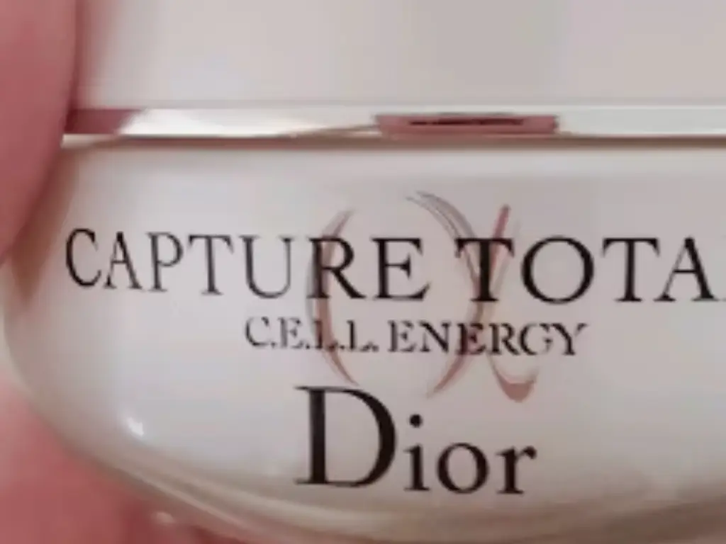
- Dior Capture Totale Cream: The luxury giant Dior gives a lesson about integrating high-end design with circularity. Their legendary heavy glass jar is constructed as a permanent one. Refill pods are lightweight plastic refill pods that fit in and enable consumers to reduce the weight and wastes of packaging by a substantial margin of more than 80 percent per refill. It is a strategy that does not undermine the luxury experience; on the contrary, it is an indication of a modern and responsible attitude and an investment in the customer in the long-term.
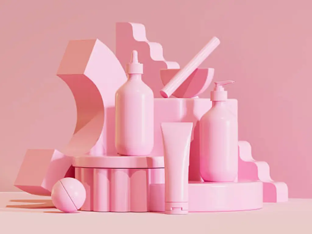
The Visual Narrative: Minimalism vs. Maximalism
The skincare packaging environment is characterized, aesthetically, by a tense relationship between two conflicting philosophies: a calm, restrained minimalism and a lively, emotional maximalism. The correct decision will solely rely on the target audience and the core message of the brand.

The strength of silent luxury continues with the simple design. This style glorifies simplicity as the highest sophistication. It is based on a well-thought-out application of the abundance of white space or negative space to produce the effect of tranquility and concentration. The design features are kept to a minimum: a simple and sophisticated color scheme, frequently monochromatic, and a focus on the texture and shape of the container itself. This will enable the product name and ingredients to shine through, creating the image of confidence, transparency, and clinical efficacy.
On the other hand, maximalism is a strong remedy to minimalist reserve. It uses the psychology of colors to establish an instant emotional bond, especially with younger customers who are social media users. This trend is marked by the use of bold colors and vibrant colors in bold combinations. Eternal gradients and changing color scheme options make the product packaging a work of art that cannot be ignored. This is less of silent confidence and more of a happy self-expression, vitality, and getting the eye in a fast-paced digital world.
Case Study in Action: Aesop
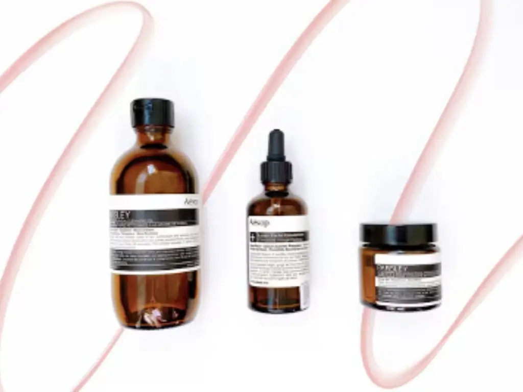
- Aesop (Minimalism): Aesop is the paradigm of the minimalism of the quiet luxury. Their standardized amber glass bottles and jars combined with a unique, cream and black label, with a simple, sans-serif typeface are immediately identifiable. The design is professional, but friendly, implying apothecary wisdom and superior and well-thought formulations. The absence of decoration only places the emphasis on the product, which sends the message of ultimate reliability.
The Art of Storytelling: Illustration, Typography, and Nostalgia
In order to break through the clutter of a saturated market, brands are resorting to more customized design features that create a distinct and ownable brand narrative. Off-the-shelf design options are no longer enough to create a memorable brand.
Custom Illustration as a Brand Signature
One of the strongest trends is the utilization of bespoke illustration as a means of conveying a unique perspective of a brand. In the case of personal care brands that are based on natural ingredients, botanical illustrations can be used to communicate the sourcing and science of their formulations in a way that is artistic. To others, abstract geometric designs may have a scientific, modern touch. This dedication to bespoke art gives the package a human touch, making it more than a mere container and a canvas on which a powerful story about the product within can be told.
Nostalgia as an Emotional Bridge
Nostalgic design decisions are used to access the shared cultural memory to establish an immediate feeling of familiarity and trust. It is not merely a recreation of the past, but a reinterpretation of the past in a contemporary context. This is reflected in the revival of 70s-style aesthetics, their rounded and soft typography, and their natural colors. We observe it in the geometrical accuracy and luxury of Art Deco motifs. And we can find it in the metallic glosses and futuristic optimism of Y2K design, which is very close to Millennial and Gen Z consumers. These design clues are an emotional shortcut, linking the brand to an existing set of positive associations.
When Typography Becomes the Star
Typography has ceased to be a supporting element in the design of cosmetic packaging. The personality of a brand can be determined by a conscious selection of typeface. The revival of serif fonts is especially remarkable; their traditional, sophisticated shapes give an impression of tradition, power, and reliability. Conversely, a confident and modern appearance can be achieved through bold typography, be it a muscular sans-serif or a bespoke script. The typographic treatment of the product name is the main graphic element in most of the cases, which proves the strength of lettering as both informative and evocative.
Case Study in Action: Drunk Elephant
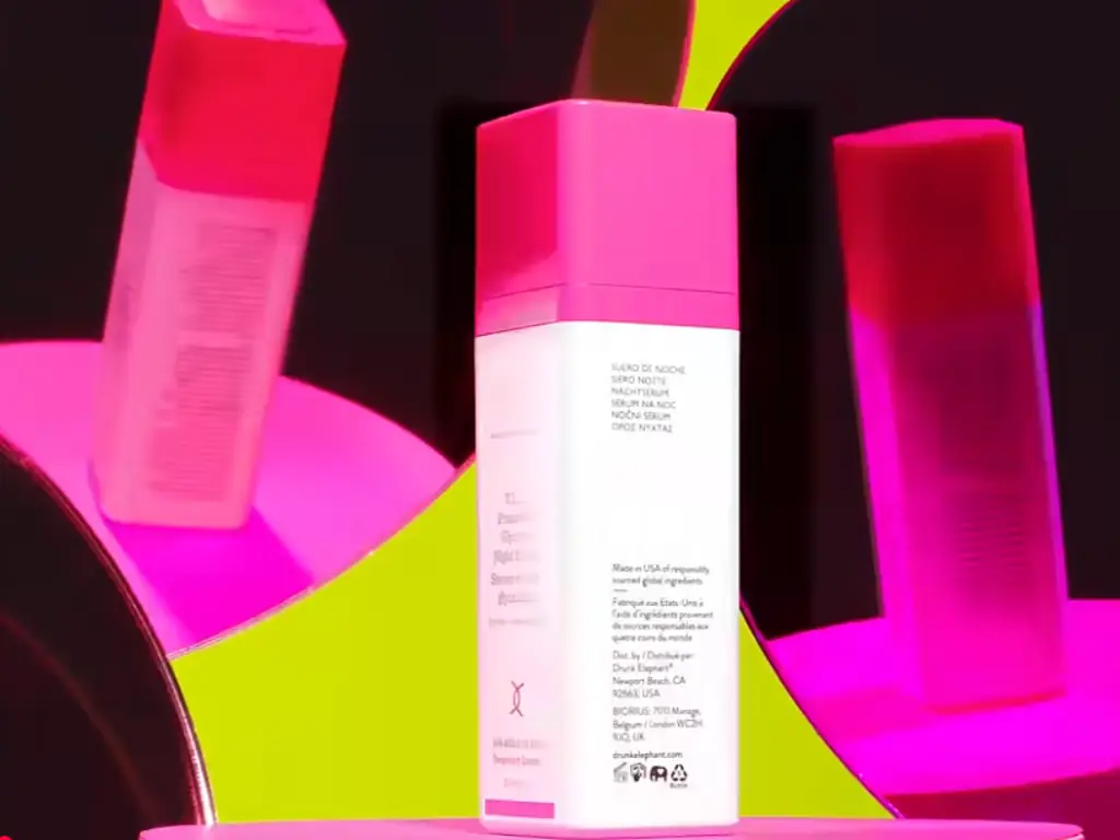
- Drunk Elephant (Typography as System): The entire visual language of this brand was based on clear and graphic typography and a mechanical color scheme. The spare white packaging is used as a stage where a bold, non-serif font and a block of bright color, which matches the product, are presented. This gives a very familiar, shelfie-posing system that is as playful as it is clinical which perfectly reflects their philosophy of biocompatibility.
Engaging the Senses: The Critical Role of Tactile Experience
The initial experience of your product is becoming more of a touch experience. The tangible experience of a package has become a strong point of difference in a digital saturation era. Weight, texture, and temperature of a container are important factors that add value to the perceived value and the overall user experience of a skincare routine. Brands are experimenting with matte finishes that are touchable, embossed logos that beg to be touched, and the pleasing weight of a well-designed container. This emphasis on the sensory experience is regarding the creation of a small luxury in a daily ritual, which makes the product more special and thoughtful.
Why Glass Excels: Marrying Sustainability with a Premium Feel
When it comes to maneuvering these intricate trends, there is always one material that will prove to be a better solution to the contemporary skincare brand: glass. It is the only product that meets the requirements of sustainability, luxury, and product integrity, and thus it is the best product to use when a brand wants to make an impression that lasts.
Glass is in a category of its own in the pursuit of real sustainability. Glass has been a pioneer when other materials are shifting towards greener solutions. Being one of the most sustainable materials, it can be recycled indefinitely without any purity or quality loss, which is why it is the foundation of a truly circular approach to packaging. It is also non-porous and inert, which makes it an ideal container of sensitive skincare products.
Glass is inherently providing the high-end touch experience that high-end customers desire. It responds to the demand of long-lasting packaging that is substantial and worthwhile. The heavy weight, cold feel and crystal clear glass bottles and jars are an automatic indication of luxury and effectiveness, keeping the strong formulations safe and presenting the product inside. This high quality directly increases the perception of the user towards the product line.
At Daxin, we enable brands to utilize these advantages. Our focus is on creating beautiful, personalized glass packaging that perfectly fits the current trends of the day, whether it is the minimalistic design popular with the quiet luxury brands or the bold custom colors to make a statement with a brand. We offer the basis of skincare product packaging that is not only aesthetically beautiful and protective but also undoubtedly accountable. Learn how our glass packaging can boost your brand.
Designing for Everyone: The Future is Inclusive and Interactive
The future of beauty is a more inclusive and technologically integrated one. The design of skincare packaging is changing in line with these changes in society. We are experiencing a significant shift to inclusivity and gender-neutral design, with the use of neutral color schemes and universal design language that is more attractive to a wider audience, breaking down the old market segmentation.
At the same time, technology is making the experience more transparent and interactive. Smart packaging is emerging as an important instrument in consumer trust building. Even the mere presence of QR codes on a package can connect a consumer to a treasure trove of information, whether it is a detailed guide on how to operate the product or a clear packaging label on the source of ingredients or the carbon footprint of the brand. This establishes a direct form of communication and builds the relationship between the brand and the consumer.
Common Mistakes to Avoid in Skincare Packaging Design
Although it is important to follow the trends, it is also crucial to avoid some pitfalls that can be made when it comes to effective packaging. One of the main mistakes is the lack of functionality; a beautiful package that is hard to open or use leaves a long-term frustration and a bad user experience. No less harmful is visual clutter or unreadable typography, which overwhelms consumers and destroys trust by hiding important information.
A key error that is strategic is a lack of connection between the packaging and the brand story. The design should be a true representation of the values of the brand- otherwise, particularly when it comes to claims of sustainability (greenwashing), it can be disastrous to the credibility. Lastly, in the modern digital market, the designers should not overlook the online shelf; the packaging should be appealing to the eye, even in the form of a tiny thumbnail. These are the basic mistakes that you should avoid in order to make sure that your packaging is not only a beautiful object, but a strong, credible tool that supports your brand image.
A Strategic Guide: How to Select the Right Trends for Your Brand
The trick to sailing through these trends is not to embrace all the new ideas. It is regarding the intentional design decisions that are a true reflection of your brand and appeal to your target audience. It needs a strategic approach.
First, define your brand core. Does your skincare brand focus on clinical and scientific, natural and holistic, or luxurious and aspirational? The first thing that your brand is seen is your packaging and it should be aligned with your core message.
Second, know your target consumer well. What are their values? Do they focus more on environmental issues, beauty, or the need to have a luxury experience? The design should address their language.
Lastly, match your product and price with your packaging. A high-end serum should have a different value proposition in its packaging than a daily cleanser. The materials, finishes, and other important aspects that you select should be worth the product being in the market.
Finally, the best cosmetics packaging design is a considerate combination of market knowledge and genuine brand narration. It is not about following the trends, but about selecting the ones that will enhance your personal story. When you consider packaging as a strategic asset, as an investment in the future of your brand, you can develop an experience that will engage consumers, create unswerving loyalty, and make sure that you are different in the cosmetics industry.